
Effective Practices for Designing Website Forms: Tips and Examples
Effective Practices for Designing Website Forms: Tips and Examples
Effective Practices for Designing Website Forms: Tips and Examples
Stop losing conversions with bad forms! Learn proven methods to design user-friendly website forms that get you more signups, leads, and sales.
Stop losing conversions with bad forms! Learn proven methods to design user-friendly website forms that get you more signups, leads, and sales.
Stop losing conversions with bad forms! Learn proven methods to design user-friendly website forms that get you more signups, leads, and sales.

Lets say, you've built an awesome website. Your products are cool, your services are top-notch, and everything looks fantastic. Someone new visits your site, excited to learn more. They browse around, clicking on things and reading all about what you offer. They're hooked!
Finally, they're ready to take the next step and contact you.
But then...
The form shows up.
It's a giant mess, with tons of boxes to fill in and instructions that don't make sense. It looks like something from an old computer game. Suddenly, all that excitement disappears. This form is confusing and frustrating, not what they expected at all. With a disappointed click, they leave your site. Ugh, so close!
This happens way more than you think. Web forms are one of the highest-converting lead generation tools. But, the mistakes you make while creating a web form ruin it all!
This article is your guide to building strong, easy-to-use website forms. The kind that turns curious visitors into happy customers.
We'll show you the key things to remember when designing forms, share some simple tips, and even show you how Metaforms can help you create awesome forms in no time. Let's get started on making forms that won't scare your visitors away!
Understanding Web Forms

Web forms are those handy things you see on websites that allow you to type in information and send it somewhere. They're like little conversation starters between you and the website owner.
Here are some of the things people can use web forms for:
Signing up for a newsletter
Ordering a product
Making a reservation
Sending a question or request
Leaving a review
Booking a demo
Web forms are like two-way streets. They allow you to gather valuable information from visitors, like their email addresses or what they're interested in. This information helps you better understand your customers and target them correctly.
But web forms also let visitors interact with you directly. They can ask questions, share feedback, or request help – all through a convenient online form. This can lead to better customer service and happier visitors!
Key Principles for Effective Web Form Design
Web forms are like salespeople on your website – they convince visitors to take action. But unlike a pushy salesperson, effective forms are clear, concise, and user-friendly. Here are the golden rules to turn your web forms into conversion champions:
Simplicity is King: People are busy, and filling out lengthy forms is a chore. Strive for short forms with only the essential fields. Ask yourself: "What's the minimum information I need from the user to achieve my goal?"
The fewer fields you have, the faster and easier it will be for visitors to complete the form.

Consistency is Key: Imagine walking into a store where the walls are green, the floor is red, and the furniture is mismatched. Confusing, right? The same goes for website design. Maintain a consistent design throughout your entire website, including your forms.
Use the same color scheme, fonts, and layout to create a familiar and comfortable experience for visitors. This consistency builds trust and makes it easier for them to navigate your form.
Space Things Out for Readability: Don't cram all your form elements together like sardines in a can! Use ample space between fields, labels, and buttons. This makes your form visually appealing and easier to read, especially on smaller screens.
Nobody likes squinting to decipher tiny text or struggling to click buttons that are too close together.
Visual Hierarchy Guides Users: Think of your form like a newspaper. Headlines are the most important information, followed by subheadings and then regular text. Use a similar visual hierarchy in your form to guide users through the completion process.
Bold labels, clear instructions, and prominent buttons will help visitors understand what information goes where and what action to take next.

Context Matters:
Placement is everything! Don't just throw your form on any random page. Put your form in a contextually relevant location. For example, a contact form belongs on your contact page, and an order form should appear after a product description.
By placing your form where visitors expect it, you'll avoid confusion and make it easier for them to find what they're looking for.
Catch Mistakes Early:
Nobody likes filling out a form only to discover at the end that they made a mistake. Use inline validation to catch errors as users type.
For example, if they enter an invalid email address, a clear error message should pop up right away, allowing them to fix it before moving on. This prevents frustration and helps ensure accurate data collection.

Open to All:
The internet should be accessible to everyone, regardless of ability. Design your forms with accessibility in mind. Use clear and descriptive labels, provide alternative text for images, and ensure your form works with assistive technologies like screen readers.
An inclusive form design shows you care about all your visitors and opens the door to a wider audience.
Best Practices for Web Form Design:
Now that you know the golden rules for effective web forms, let's get down to brass tacks! Here are some practical tips to transform those good forms into great forms:
Less is Definitely More: Remember, simplicity is king. Ruthlessly cut down on unnecessary form fields. Only ask for information you absolutely need to achieve your goal. The fewer fields visitors have to fill out, the faster they'll complete the form and the happier they'll be. Think of it like this: shorter forms mean less time spent typing and more time browsing your amazing products or services!
Single Column for the Win: Imagine a crowded hallway with people rushing everywhere. Not exactly a pleasant experience, right? The same goes for multi-column forms. They can be confusing and overwhelming for users. Stick to a single-column layout for your web forms. This creates a clear path for users to follow and makes scanning and completing the form easier.
Field Trip Efficiency: There are different types of form fields for a reason! Choose the right field type for each piece of information you collect. For example, use a dropdown menu for selecting options, a date picker for choosing dates, and email fields specifically for email addresses. This helps users fill out the form faster and reduces the chances of errors. Imagine trying to type in a date using a regular text field – not fun!
Break It Down, Break It Up: If you absolutely must have a complex form with lots of fields, don't overwhelm your visitors! Break the form down into manageable steps or pages. This makes the process less daunting and allows users to focus on one section at a time. Think of it like climbing a staircase – one step at a time is much easier than trying to jump to the top!
Auto-fill the Way: Modern browsers offer a handy feature called auto-fill, which remembers information users have entered previously. Take advantage of this by enabling auto-fill on your forms. This saves users time and effort by pre-filling in fields like names, addresses, and email addresses. It's a win-win situation for everyone!

Clarity is Key: Nobody likes guessing what a button does or what information should go in a form field. Use clear and concise labels for every field and button on your form. The labels should be easy to understand and leave no room for confusion. For example, instead of a generic "Submit" button, use something more specific like "Sign Up Now" or "Download My eBook."
Accessibility for All: As we mentioned earlier, web forms should be accessible to everyone. Incorporate accessibility best practices into your form design. Use clear labels, provide alternative image text descriptions, and ensure your form works with screen readers and other assistive technologies. This makes your website inclusive and allows everyone to interact with your forms.
Common Mistakes in Web Form Design:
We've covered the golden rules and best practices for designing stellar web forms. Now, let's turn the spotlight on some common pitfalls to avoid. By recognizing these mistakes, you can ensure your forms are user-friendly and don't scare visitors away:
Information Overload: Remember that less is more! Don't bombard users with unnecessary form fields. Ask only for the essential information you truly need. Every extra field adds another hurdle for users to jump over, potentially leading them to abandon the form altogether.
Lost in Translation: Clear instructions are vital for a smooth form completion experience. Avoid vague or confusing instructions. Explain the information needed in each field and how the form will be used. Think of it like giving users a clear roadmap – they'll know exactly where they're going and how to get there.
Field Fumble: Imagine searching for a specific item in a messy drawer. It's frustrating, right? The same goes for illogical form field placement. Organize your form fields in a logical sequence and group related fields together. This makes it easier for users to scan the form and understand the flow of information.
Leaving People Behind: Accessibility is key! Don't neglect to design your forms with inclusivity in mind. Use clear and descriptive labels, provide alternative text for images, and ensure your form works with assistive technologies. An accessible form welcomes everyone and expands your potential audience.
Advanced Web Form Tips:
We've now equipped you with the knowledge to design user-friendly stellar web forms that convert visitors into happy customers. But there's always room for improvement! Here are some advanced tips to take your forms from good to great:
Location, Location, Location: Many users allow websites to access their location information. Use geolocation to pre-fill certain form fields, like city or zip code. This saves users time and effort and provides a more personalized experience. Imagine a form that automatically populates the city field based on the user's location – that's a timesaver!
Mobile Magic: These days, most people access websites from their smartphones. Ensure your forms are mobile-friendly. Use a responsive design that adjusts to different screen sizes, and make sure form fields are large enough for easy tapping. Also, consider using on-screen keyboards that automatically switch to the appropriate input type (like numbers for a phone number field). A smooth mobile form experience is key for capturing those on-the-go users!
Mobile Marvels: Mobile users expect a streamlined experience. Go beyond basic mobile responsiveness for your forms. Consider features like auto-complete for addresses and one-click options for common selections. You can even explore voice-enabled forms for added convenience. Remember, mobile users are all about speed and ease – cater to their needs!
Security Shouldn't Sacrifice Usability: Keeping your website secure is important, but security measures shouldn't frustrate users. Incorporate tools like reCAPTCHA to prevent spam submissions without hindering the form completion process. Look for solutions that offer a balance between security and user experience.
Conclusion:
User testing is crucial – gather feedback on your forms and continuously refine them for optimal user experience. The world of web forms is constantly evolving, so stay updated on best practices and embrace new technologies. Speaking of innovation, consider Metaforms – a powerful tool that goes beyond basic form creation.
Metaforms allows you to design visually appealing forms, capture rich user data through conditional logic, and integrate seamlessly with your existing marketing tools. With Metaforms, you can ditch the limitations of traditional forms and create exceptional experiences that convert visitors into loyal customers.
So, don't let clunky forms hold you back. Build better forms, build stronger relationships, and watch your business soar!
Lets say, you've built an awesome website. Your products are cool, your services are top-notch, and everything looks fantastic. Someone new visits your site, excited to learn more. They browse around, clicking on things and reading all about what you offer. They're hooked!
Finally, they're ready to take the next step and contact you.
But then...
The form shows up.
It's a giant mess, with tons of boxes to fill in and instructions that don't make sense. It looks like something from an old computer game. Suddenly, all that excitement disappears. This form is confusing and frustrating, not what they expected at all. With a disappointed click, they leave your site. Ugh, so close!
This happens way more than you think. Web forms are one of the highest-converting lead generation tools. But, the mistakes you make while creating a web form ruin it all!
This article is your guide to building strong, easy-to-use website forms. The kind that turns curious visitors into happy customers.
We'll show you the key things to remember when designing forms, share some simple tips, and even show you how Metaforms can help you create awesome forms in no time. Let's get started on making forms that won't scare your visitors away!
Understanding Web Forms
Web forms are those handy things you see on websites that allow you to type in information and send it somewhere. They're like little conversation starters between you and the website owner.
Here are some of the things people can use web forms for:
Signing up for a newsletter
Ordering a product
Making a reservation
Sending a question or request
Leaving a review
Booking a demo
Web forms are like two-way streets. They allow you to gather valuable information from visitors, like their email addresses or what they're interested in. This information helps you better understand your customers and target them correctly.
But web forms also let visitors interact with you directly. They can ask questions, share feedback, or request help – all through a convenient online form. This can lead to better customer service and happier visitors!
Key Principles for Effective Web Form Design
Web forms are like salespeople on your website – they convince visitors to take action. But unlike a pushy salesperson, effective forms are clear, concise, and user-friendly. Here are the golden rules to turn your web forms into conversion champions:
Simplicity is King: People are busy, and filling out lengthy forms is a chore. Strive for short forms with only the essential fields. Ask yourself: "What's the minimum information I need from the user to achieve my goal?"
The fewer fields you have, the faster and easier it will be for visitors to complete the form.
Consistency is Key: Imagine walking into a store where the walls are green, the floor is red, and the furniture is mismatched. Confusing, right? The same goes for website design. Maintain a consistent design throughout your entire website, including your forms.
Use the same color scheme, fonts, and layout to create a familiar and comfortable experience for visitors. This consistency builds trust and makes it easier for them to navigate your form.
Space Things Out for Readability: Don't cram all your form elements together like sardines in a can! Use ample space between fields, labels, and buttons. This makes your form visually appealing and easier to read, especially on smaller screens.
Nobody likes squinting to decipher tiny text or struggling to click buttons that are too close together.
Visual Hierarchy Guides Users: Think of your form like a newspaper. Headlines are the most important information, followed by subheadings and then regular text. Use a similar visual hierarchy in your form to guide users through the completion process.
Bold labels, clear instructions, and prominent buttons will help visitors understand what information goes where and what action to take next.
Context Matters:
Placement is everything! Don't just throw your form on any random page. Put your form in a contextually relevant location. For example, a contact form belongs on your contact page, and an order form should appear after a product description.
By placing your form where visitors expect it, you'll avoid confusion and make it easier for them to find what they're looking for.
Catch Mistakes Early:
Nobody likes filling out a form only to discover at the end that they made a mistake. Use inline validation to catch errors as users type.
For example, if they enter an invalid email address, a clear error message should pop up right away, allowing them to fix it before moving on. This prevents frustration and helps ensure accurate data collection.
Open to All:
The internet should be accessible to everyone, regardless of ability. Design your forms with accessibility in mind. Use clear and descriptive labels, provide alternative text for images, and ensure your form works with assistive technologies like screen readers.
An inclusive form design shows you care about all your visitors and opens the door to a wider audience.
Best Practices for Web Form Design:
Now that you know the golden rules for effective web forms, let's get down to brass tacks! Here are some practical tips to transform those good forms into great forms:
Less is Definitely More: Remember, simplicity is king. Ruthlessly cut down on unnecessary form fields. Only ask for information you absolutely need to achieve your goal. The fewer fields visitors have to fill out, the faster they'll complete the form and the happier they'll be. Think of it like this: shorter forms mean less time spent typing and more time browsing your amazing products or services!
Single Column for the Win: Imagine a crowded hallway with people rushing everywhere. Not exactly a pleasant experience, right? The same goes for multi-column forms. They can be confusing and overwhelming for users. Stick to a single-column layout for your web forms. This creates a clear path for users to follow and makes scanning and completing the form easier.
Field Trip Efficiency: There are different types of form fields for a reason! Choose the right field type for each piece of information you collect. For example, use a dropdown menu for selecting options, a date picker for choosing dates, and email fields specifically for email addresses. This helps users fill out the form faster and reduces the chances of errors. Imagine trying to type in a date using a regular text field – not fun!
Break It Down, Break It Up: If you absolutely must have a complex form with lots of fields, don't overwhelm your visitors! Break the form down into manageable steps or pages. This makes the process less daunting and allows users to focus on one section at a time. Think of it like climbing a staircase – one step at a time is much easier than trying to jump to the top!
Auto-fill the Way: Modern browsers offer a handy feature called auto-fill, which remembers information users have entered previously. Take advantage of this by enabling auto-fill on your forms. This saves users time and effort by pre-filling in fields like names, addresses, and email addresses. It's a win-win situation for everyone!
Clarity is Key: Nobody likes guessing what a button does or what information should go in a form field. Use clear and concise labels for every field and button on your form. The labels should be easy to understand and leave no room for confusion. For example, instead of a generic "Submit" button, use something more specific like "Sign Up Now" or "Download My eBook."
Accessibility for All: As we mentioned earlier, web forms should be accessible to everyone. Incorporate accessibility best practices into your form design. Use clear labels, provide alternative image text descriptions, and ensure your form works with screen readers and other assistive technologies. This makes your website inclusive and allows everyone to interact with your forms.
Common Mistakes in Web Form Design:
We've covered the golden rules and best practices for designing stellar web forms. Now, let's turn the spotlight on some common pitfalls to avoid. By recognizing these mistakes, you can ensure your forms are user-friendly and don't scare visitors away:
Information Overload: Remember that less is more! Don't bombard users with unnecessary form fields. Ask only for the essential information you truly need. Every extra field adds another hurdle for users to jump over, potentially leading them to abandon the form altogether.
Lost in Translation: Clear instructions are vital for a smooth form completion experience. Avoid vague or confusing instructions. Explain the information needed in each field and how the form will be used. Think of it like giving users a clear roadmap – they'll know exactly where they're going and how to get there.
Field Fumble: Imagine searching for a specific item in a messy drawer. It's frustrating, right? The same goes for illogical form field placement. Organize your form fields in a logical sequence and group related fields together. This makes it easier for users to scan the form and understand the flow of information.
Leaving People Behind: Accessibility is key! Don't neglect to design your forms with inclusivity in mind. Use clear and descriptive labels, provide alternative text for images, and ensure your form works with assistive technologies. An accessible form welcomes everyone and expands your potential audience.
Advanced Web Form Tips:
We've now equipped you with the knowledge to design user-friendly stellar web forms that convert visitors into happy customers. But there's always room for improvement! Here are some advanced tips to take your forms from good to great:
Location, Location, Location: Many users allow websites to access their location information. Use geolocation to pre-fill certain form fields, like city or zip code. This saves users time and effort and provides a more personalized experience. Imagine a form that automatically populates the city field based on the user's location – that's a timesaver!
Mobile Magic: These days, most people access websites from their smartphones. Ensure your forms are mobile-friendly. Use a responsive design that adjusts to different screen sizes, and make sure form fields are large enough for easy tapping. Also, consider using on-screen keyboards that automatically switch to the appropriate input type (like numbers for a phone number field). A smooth mobile form experience is key for capturing those on-the-go users!
Mobile Marvels: Mobile users expect a streamlined experience. Go beyond basic mobile responsiveness for your forms. Consider features like auto-complete for addresses and one-click options for common selections. You can even explore voice-enabled forms for added convenience. Remember, mobile users are all about speed and ease – cater to their needs!
Security Shouldn't Sacrifice Usability: Keeping your website secure is important, but security measures shouldn't frustrate users. Incorporate tools like reCAPTCHA to prevent spam submissions without hindering the form completion process. Look for solutions that offer a balance between security and user experience.
Conclusion:
User testing is crucial – gather feedback on your forms and continuously refine them for optimal user experience. The world of web forms is constantly evolving, so stay updated on best practices and embrace new technologies. Speaking of innovation, consider Metaforms – a powerful tool that goes beyond basic form creation.
Metaforms allows you to design visually appealing forms, capture rich user data through conditional logic, and integrate seamlessly with your existing marketing tools. With Metaforms, you can ditch the limitations of traditional forms and create exceptional experiences that convert visitors into loyal customers.
So, don't let clunky forms hold you back. Build better forms, build stronger relationships, and watch your business soar!

SAAS Pricing Calculators: B2B v B2C Online Forms.
The SaaS pricing calculator is an essential tool for both B2B and B2C SaaS companies. But how do you build it, right? We have you covered.

B2B SaaS: Making Book a Demo Form.
Having the perfect book a demo form for B2B SaaS is the first step in capturing leads. There are a few fundamental techniques to get this form right. Read on.

How to Get Started With SaaS Onboarding.
SaaS onboarding is essential for customer onboarding in B2B and B2C SaaS. Let’s understand its fundamentals, including the metrics.
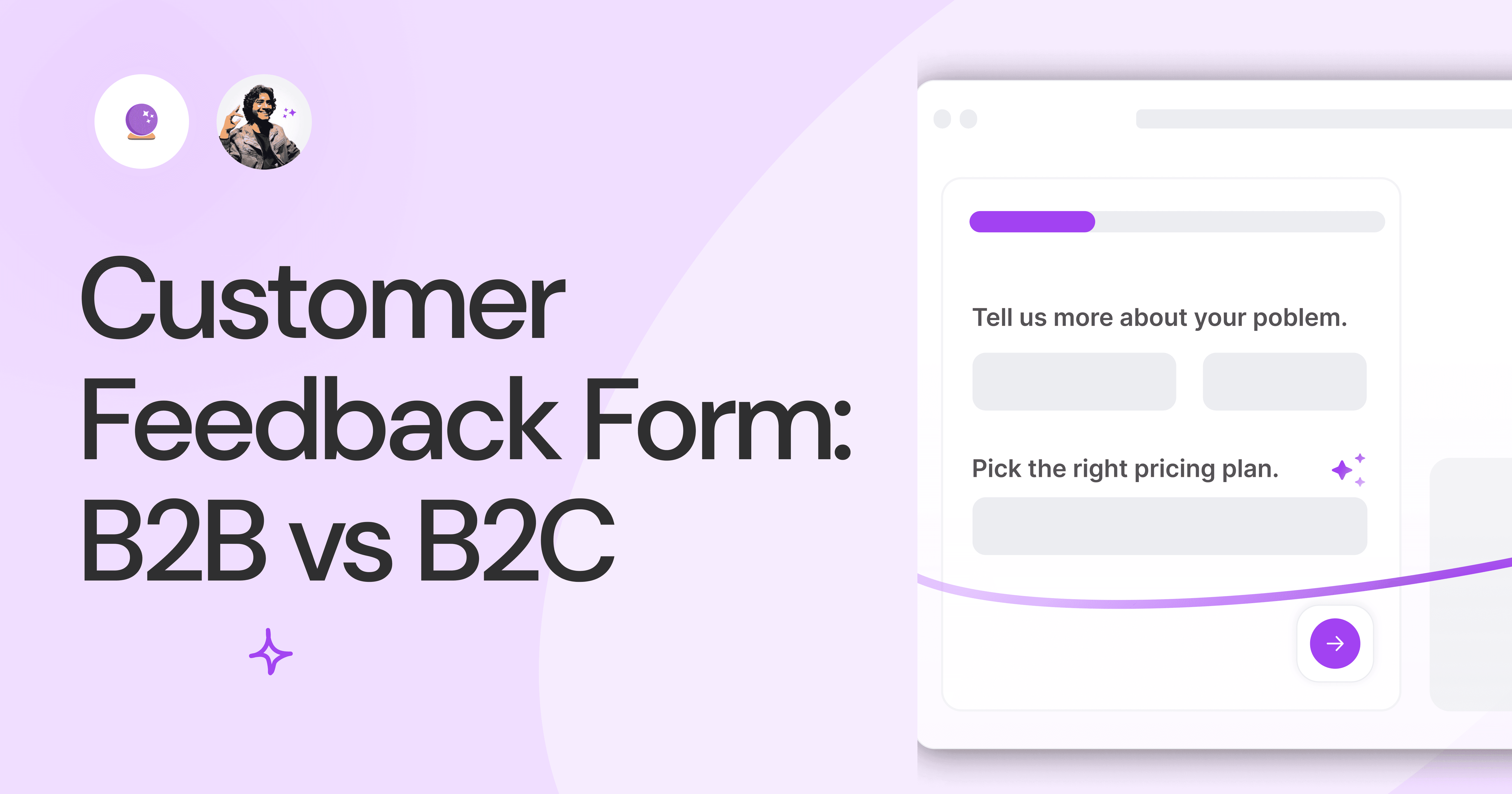
Customer Feedback Form: B2B vs B2C.
Why is customer feedback important? Because it dictates progress on B2B and B2B products and services for the customer to meet their goals.

SaaS Customer Feedback Form: 6 Main Types.
As much as SaaS is self-serve, the role of a customer feedback form is highly relevant. There are different types, each with its use case and sections.

Role of a Product Survey in SaaS.
SaaS is all about creating products for specific use cases. This is where a product survey becomes all the more important to know the user deeply.

Should You Do a SaaS Market Survey?
Every SaaS company wants to grow fast. But without a market survey, growth isn't possible or sustainable. Let’s see how to do a market survey.
SAAS Pricing Calculators: B2B v B2C Online Forms.
The SaaS pricing calculator is an essential tool for both B2B and B2C SaaS companies. But how do you build it, right? We have you covered.
B2B SaaS: Making Book a Demo Form.
Having the perfect book a demo form for B2B SaaS is the first step in capturing leads. There are a few fundamental techniques to get this form right. Read on.
How to Get Started With SaaS Onboarding.
SaaS onboarding is essential for customer onboarding in B2B and B2C SaaS. Let’s understand its fundamentals, including the metrics.
Customer Feedback Form: B2B vs B2C.
Why is customer feedback important? Because it dictates progress on B2B and B2B products and services for the customer to meet their goals.
SaaS Customer Feedback Form: 6 Main Types.
As much as SaaS is self-serve, the role of a customer feedback form is highly relevant. There are different types, each with its use case and sections.
Role of a Product Survey in SaaS.
SaaS is all about creating products for specific use cases. This is where a product survey becomes all the more important to know the user deeply.
Should You Do a SaaS Market Survey?
Every SaaS company wants to grow fast. But without a market survey, growth isn't possible or sustainable. Let’s see how to do a market survey.

Nine Types of Healthcare and Medical Forms.
Medical forms are a must-have for any healthcare business or practitioner. Learn about the different kinds of medical and healthcare forms.

4 Tips for Better Medical History Forms.
Medical history forms are central to patient care, onboarding, and medical administration records. Learn how to make them easier to fill.

How to Build Mental Health Intake Forms?
Mental health intake forms are not like patient intake forms. Mental health intake forms deal with far more sensitive data and have specific design methods.
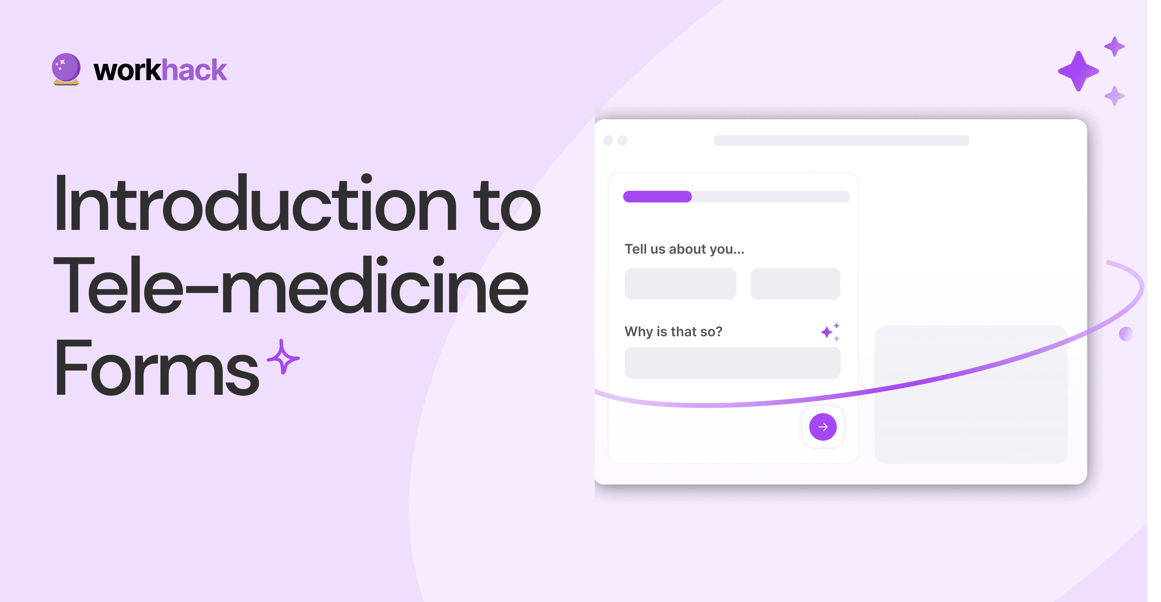
What, Why and How of Telemedicine Forms.
Telemedicine is on the rise and with different form builders out there, which one best suits your needs as a healthcare services provider?

3 Reasons for Major Drop-Offs in Medical Forms.
No matter which healthcare form we pick, there are major drop-off reasons. We shall dive into the top 3 and learn how to resolve them in your next form.

Patient Onboarding Forms - From Click to Clinic.
Patient onboarding forms are the first touchpoint for patients; getting this right for higher conversion rates is a must-have. Learn how to perfect them now.

5 Key Parts of a Good Patient Satisfaction Form.
The goal of patient satisfaction surveys is to course-correct the services of a healthcare provider. Patient feedback leads to a culture of patient-centric care.
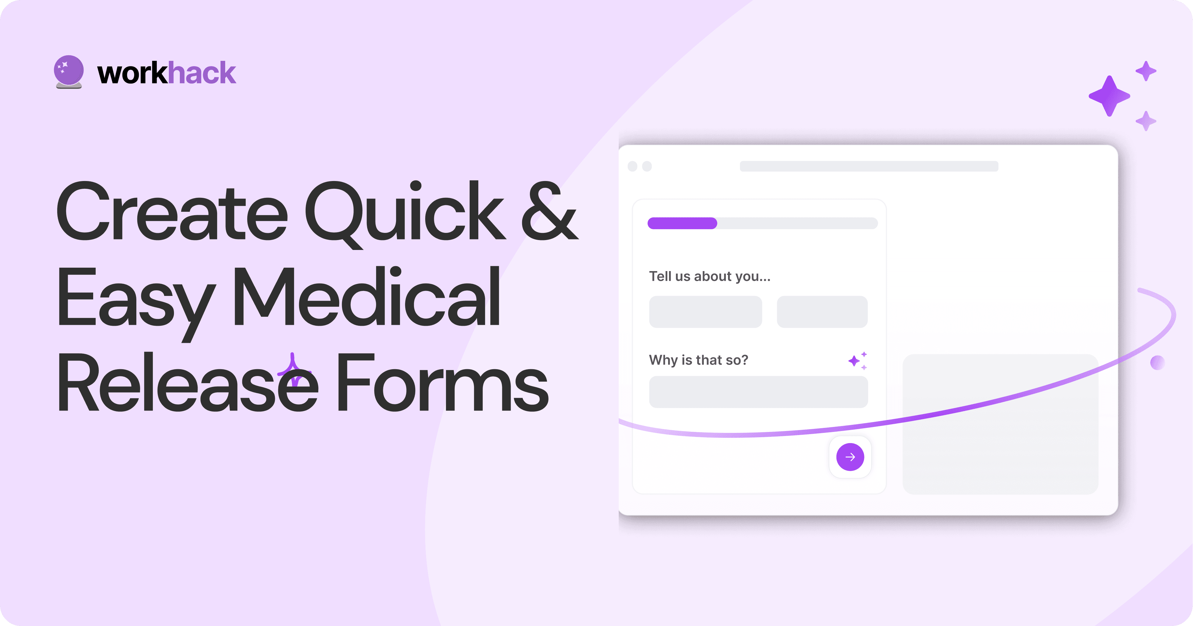
Build Quick and Easy Medical Release Forms.
Every HIPAA-compliant healthcare provider comes across medical release forms that involve details from medical history forms. Can they be shipped fast? Yes.
SAAS Pricing Calculators: B2B v B2C Online Forms.
The SaaS pricing calculator is an essential tool for both B2B and B2C SaaS companies. But how do you build it, right? We have you covered.
B2B SaaS: Making Book a Demo Form.
Having the perfect book a demo form for B2B SaaS is the first step in capturing leads. There are a few fundamental techniques to get this form right. Read on.
How to Get Started With SaaS Onboarding.
SaaS onboarding is essential for customer onboarding in B2B and B2C SaaS. Let’s understand its fundamentals, including the metrics.
Customer Feedback Form: B2B vs B2C.
Why is customer feedback important? Because it dictates progress on B2B and B2B products and services for the customer to meet their goals.
SaaS Customer Feedback Form: 6 Main Types.
As much as SaaS is self-serve, the role of a customer feedback form is highly relevant. There are different types, each with its use case and sections.
Role of a Product Survey in SaaS.
SaaS is all about creating products for specific use cases. This is where a product survey becomes all the more important to know the user deeply.
Should You Do a SaaS Market Survey?
Every SaaS company wants to grow fast. But without a market survey, growth isn't possible or sustainable. Let’s see how to do a market survey.

Subscribe to stay updated.
Subscribe to stay updated.
Subscribe to stay updated.
HC

HC

HC

HC

70+ people from across industries read our emails.
HC
HC
70+ people from across industries read our emails.
HC
HC
HC
70+ people from across industries read our emails.


Bangalore, India / San Francisco, US
WorkHack Inc. 2023


Bangalore, India
San Francisco, US
WorkHack Inc. 2023
WorkHack Inc. 2023
Bangalore, India / San Francisco, US
WorkHack Inc. 2023
Bangalore, India / San Francisco, US