
Form Layout: Tips and Best Practices for User-Friendly Design
Form Layout: Tips and Best Practices for User-Friendly Design
Form Layout: Tips and Best Practices for User-Friendly Design
Learn how to design forms that are easy to fill out and get you more results. Get tips for layout, mobile-friendliness, and clear instructions.
Learn how to design forms that are easy to fill out and get you more results. Get tips for layout, mobile-friendliness, and clear instructions.
Learn how to design forms that are easy to fill out and get you more results. Get tips for layout, mobile-friendliness, and clear instructions.

Have you ever gotten stuck filling out a form online? Maybe the instructions were unclear, the buttons were too small, or you just couldn't figure out where to put your information. Frustrating, right?
How you design your forms can greatly affect how people experience your website. A confusing form can leave users feeling lost and annoyed; they might just give up before they finish. On the other hand, a well-designed form is easy to use and understand, making the whole process smooth and painless.
Why does user-friendly form design matter?
Good form design makes interacting with your website a positive experience, leaving users with a good impression.
Did you know that studies show a whopping 69.8% of shopping carts get abandoned because of checkout forms that are too complex or frustrating?
Platforms like MetaForms leverage AI to understand user behavior, making form completion not just easier but also more engaging.
By designing user-friendly forms, you can dramatically increase the number of people who complete them, whether they're sign-up forms, contact forms, or other types.
Best Practices for Designing Form Layouts:
Now that you know why user-friendly forms are crucial, let's dive into some key best practices to keep in mind:
Keep it Clean and Condensed:

Most experts recommend using a single-column layout for your forms instead of a 2-column layout, which can be confusing on smaller screens. This makes it easier for users to scan and follow the flow of information, especially on mobile devices. Studies have shown that single-column forms can lead to faster completion times.
Match the Layout to the Input:
Think about the type of information you're collecting. For example, use wide text fields for addresses and shorter fields for names. Align radio buttons and checkboxes vertically for easy selection. This creates a visually clear and intuitive experience for users.
Long Forms? Break Them Up!

No one likes staring down a giant wall of text! If your form has a lot of fields, consider splitting it into multiple pages. This makes it feel less overwhelming and keeps users engaged as they progress through the form. You can even include a progress bar to show them how far they've come.
Mobile-First Design is a Must:
In today's world, most people use their phones to browse the web. So it's essential to ensure your forms look great and function smoothly on all devices, especially smartphones and tablets. Test your forms on different screen sizes to identify any potential issues.
Make it Conversational:
Ditch the long list of questions and turn your form into a conversation! Break it down into smaller, more manageable steps with clear instructions. This makes the process feel more engaging and less like a chore.
Style Matters, But Keep it User-Friendly:
You can definitely customize the look and feel of your forms to match your website's theme. But remember to prioritize clarity over fancy design elements. Ensure fonts are easy to read, colors provide good contrast, and buttons are clear and actionable.
Help Users Avoid Mistakes:
Nobody likes filling out a form only to discover they made a mistake. Use inline validation wisely to enhance the user experience, providing feedback once the user has finished entering information in a field rather than immediately during typing to avoid confusion.
Specific Tips to Improve Form Structure:
Ditch the Paper Look
Skip replicating a paper form line-by-line. Digital forms offer more flexibility! Use features like dropdown menus that pre-populate options or date pickers that automatically select dates with a calendar pop-up. This reduces typing errors and makes filling out the form faster and more enjoyable.
Create Clear Boundaries:
Make your form stand out from the background! Use a visual container, like a box with a slightly different background color or a thin border, to define the edges of the form. This clear separation helps users know exactly where to focus their attention and avoid confusion with other website elements.
Keyboard Friendly Forms:
Not everyone uses a mouse, and some users may have accessibility needs. Ensure your form can be easily navigated using the keyboard's tab key to move between fields. This inclusivity creates a smoother experience for all users, regardless of their browsing style.
Streamline for Efficiency:
Keep it short and sweet! Ask only for the information you absolutely need to achieve your goal. The fewer fields users must fill out, the faster they'll complete the form. If something's not crucial for your purpose, consider making it optional.
Matching Expectations:
Use clear field types to guide users and avoid confusion. For phone numbers, use a phone number field that might pre-format the numbers with dashes. For email addresses, use an email field that highlights the "@" symbol. This intuitive design helps users avoid typos and makes data entry more efficient.
Promote Clarity:
Short and clear labels are key! Use concise, easy-to-understand language for each form field. Avoid jargon or technical terms that users might not be familiar with. Consistency is also important – use the same formatting and tone for labels throughout the form.
Ditch the Reset Button:
Consider omitting the reset button to avoid accidental data loss, as users who wish to start over can manually clear the fields, providing a safer user experience. The reset button can be confusing and isn't really necessary.
Plan for Errors:
Mistakes happen, but you can minimize frustration. Be prepared with clear and specific error messages that tell users exactly what went wrong and how to fix it. Show the error message right next to the incorrect field for easy identification. Use helpful language that guides users towards the correct format or answer.
Single Column for the Win:
A single-column layout keeps things organized and improves readability, especially on mobile devices with limited screen space. This layout prevents users from getting lost in a maze of information and makes the form easier to scan and follow visually.
Conversational Flow for a Smooth Journey:
Imagine you're having a conversation with the user. Order your form fields in a logical sequence that makes sense and feels like a natural back-and-forth. Start with basic information like name and email, then progress to more specific details relevant to the form's purpose. This conversational flow creates a user-friendly experience that's easy to complete.
Additional Considerations in Form Design:
We've covered a lot of ground in building user-friendly forms! But there's always more to learn. Here are two additional considerations to keep in mind:
Creating Conversational Surveys for a More Interactive Experience
Surveys don't have to be static lists of questions. Consider using a conversational format to break down your survey into smaller, more manageable steps. This can make it feel less like a chore and more like a friendly dialogue. Here are some ways to achieve a conversational flow:
Use natural language. Frame your questions so that they sound like you're talking directly to the user.
Break it down: Instead of one long survey, divide it into sections with clear headings and concise questions.
Progress indicators: Show users how far they've progressed through the survey, keeping them motivated to finish.
Ensuring Accurate User Input, Particularly for Email Addresses
Accurate user input is crucial for getting the most out of your forms. Here are some tips to ensure users enter their email addresses correctly:
Clear labeling: Use a "Email Address" label to avoid confusion.
Right field type: Use an email format highlighting the "@" symbol. This can help guide users towards the correct format.
Validation: Implement validation to check for common email address errors, such as missing "@" symbols or periods. Provide clear error messages if the format is incorrect.
Consider asking users to enter the information twice for crucial contact information like email addresses. This double confirmation can significantly reduce the chances of typos.
Resources and Tools for Form Creation:
While MetaForms, WPForms, and Gravity Forms are great starting points, explore a variety of form creation tools to find the one that best matches your specific requirements and offers the features you value most. Here are some helpful resources and tools to get you started:
MetaForms: This powerful form creation platform offers a wide range of features designed to help you build user-friendly and visually appealing forms. Explore its drag-and-drop interface, pre-built templates, and advanced features like conditional logic and progress bars. MetaForms also seamlessly integrates with many popular marketing and CRM tools.
WPForms: A popular choice for WordPress users, WPForms offers a user-friendly interface and a variety of layout presets to get you started quickly. You can easily customize your forms with no coding required to match your website's theme and branding. WPForms also integrates with popular payment gateways and email marketing services.
Gravity Forms: Another well-regarded option for WordPress users, Gravity Forms offers a robust set of features and advanced functionality. This plugin is known for its excellent support and ensures compliance with WordPress coding standards. Gravity Forms integrates with various third-party services for even greater flexibility.
Remember: Consider your specific needs and technical expertise when choosing a form creation tool. Look for a platform that offers user-friendly features, integrates with the tools you already use, and fits your budget.
Frequently asked questions on form layouts:
How should forms be structured for better clarity and guidance?
Single column, logical order, clear labels: This keeps things organized and guides users through the process.
Why is it recommended to limit the number of fields on a form?
Less is more = faster completion: Fewer fields mean less frustration and higher completion rates.
What are some common form layout mistakes to avoid?
Tiny elements, unclear labels, mobile issues, and bad error messages: These all frustrate users and make form completion difficult.
How can I make my forms more engaging?
Conversational format, visuals, progress bars: Create a more interactive experience that motivates users.
What are some best practices for ensuring accurate user input?
Right field types, validation, and clear instructions: Guide users towards entering information in the correct format.
Consider leveraging MetaForm’s AI capabilities to create forms that adapt and respond to user inputs, making each interaction memorable.
Have you ever gotten stuck filling out a form online? Maybe the instructions were unclear, the buttons were too small, or you just couldn't figure out where to put your information. Frustrating, right?
How you design your forms can greatly affect how people experience your website. A confusing form can leave users feeling lost and annoyed; they might just give up before they finish. On the other hand, a well-designed form is easy to use and understand, making the whole process smooth and painless.
Why does user-friendly form design matter?
Good form design makes interacting with your website a positive experience, leaving users with a good impression.
Did you know that studies show a whopping 69.8% of shopping carts get abandoned because of checkout forms that are too complex or frustrating?
Platforms like MetaForms leverage AI to understand user behavior, making form completion not just easier but also more engaging.
By designing user-friendly forms, you can dramatically increase the number of people who complete them, whether they're sign-up forms, contact forms, or other types.
Best Practices for Designing Form Layouts:
Now that you know why user-friendly forms are crucial, let's dive into some key best practices to keep in mind:
Keep it Clean and Condensed:
Most experts recommend using a single-column layout for your forms instead of a 2-column layout, which can be confusing on smaller screens. This makes it easier for users to scan and follow the flow of information, especially on mobile devices. Studies have shown that single-column forms can lead to faster completion times.
Match the Layout to the Input:
Think about the type of information you're collecting. For example, use wide text fields for addresses and shorter fields for names. Align radio buttons and checkboxes vertically for easy selection. This creates a visually clear and intuitive experience for users.
Long Forms? Break Them Up!
No one likes staring down a giant wall of text! If your form has a lot of fields, consider splitting it into multiple pages. This makes it feel less overwhelming and keeps users engaged as they progress through the form. You can even include a progress bar to show them how far they've come.
Mobile-First Design is a Must:
In today's world, most people use their phones to browse the web. So it's essential to ensure your forms look great and function smoothly on all devices, especially smartphones and tablets. Test your forms on different screen sizes to identify any potential issues.
Make it Conversational:
Ditch the long list of questions and turn your form into a conversation! Break it down into smaller, more manageable steps with clear instructions. This makes the process feel more engaging and less like a chore.
Style Matters, But Keep it User-Friendly:
You can definitely customize the look and feel of your forms to match your website's theme. But remember to prioritize clarity over fancy design elements. Ensure fonts are easy to read, colors provide good contrast, and buttons are clear and actionable.
Help Users Avoid Mistakes:
Nobody likes filling out a form only to discover they made a mistake. Use inline validation wisely to enhance the user experience, providing feedback once the user has finished entering information in a field rather than immediately during typing to avoid confusion.
Specific Tips to Improve Form Structure:
Ditch the Paper Look
Skip replicating a paper form line-by-line. Digital forms offer more flexibility! Use features like dropdown menus that pre-populate options or date pickers that automatically select dates with a calendar pop-up. This reduces typing errors and makes filling out the form faster and more enjoyable.
Create Clear Boundaries:
Make your form stand out from the background! Use a visual container, like a box with a slightly different background color or a thin border, to define the edges of the form. This clear separation helps users know exactly where to focus their attention and avoid confusion with other website elements.
Keyboard Friendly Forms:
Not everyone uses a mouse, and some users may have accessibility needs. Ensure your form can be easily navigated using the keyboard's tab key to move between fields. This inclusivity creates a smoother experience for all users, regardless of their browsing style.
Streamline for Efficiency:
Keep it short and sweet! Ask only for the information you absolutely need to achieve your goal. The fewer fields users must fill out, the faster they'll complete the form. If something's not crucial for your purpose, consider making it optional.
Matching Expectations:
Use clear field types to guide users and avoid confusion. For phone numbers, use a phone number field that might pre-format the numbers with dashes. For email addresses, use an email field that highlights the "@" symbol. This intuitive design helps users avoid typos and makes data entry more efficient.
Promote Clarity:
Short and clear labels are key! Use concise, easy-to-understand language for each form field. Avoid jargon or technical terms that users might not be familiar with. Consistency is also important – use the same formatting and tone for labels throughout the form.
Ditch the Reset Button:
Consider omitting the reset button to avoid accidental data loss, as users who wish to start over can manually clear the fields, providing a safer user experience. The reset button can be confusing and isn't really necessary.
Plan for Errors:
Mistakes happen, but you can minimize frustration. Be prepared with clear and specific error messages that tell users exactly what went wrong and how to fix it. Show the error message right next to the incorrect field for easy identification. Use helpful language that guides users towards the correct format or answer.
Single Column for the Win:
A single-column layout keeps things organized and improves readability, especially on mobile devices with limited screen space. This layout prevents users from getting lost in a maze of information and makes the form easier to scan and follow visually.
Conversational Flow for a Smooth Journey:
Imagine you're having a conversation with the user. Order your form fields in a logical sequence that makes sense and feels like a natural back-and-forth. Start with basic information like name and email, then progress to more specific details relevant to the form's purpose. This conversational flow creates a user-friendly experience that's easy to complete.
Additional Considerations in Form Design:
We've covered a lot of ground in building user-friendly forms! But there's always more to learn. Here are two additional considerations to keep in mind:
Creating Conversational Surveys for a More Interactive Experience
Surveys don't have to be static lists of questions. Consider using a conversational format to break down your survey into smaller, more manageable steps. This can make it feel less like a chore and more like a friendly dialogue. Here are some ways to achieve a conversational flow:
Use natural language. Frame your questions so that they sound like you're talking directly to the user.
Break it down: Instead of one long survey, divide it into sections with clear headings and concise questions.
Progress indicators: Show users how far they've progressed through the survey, keeping them motivated to finish.
Ensuring Accurate User Input, Particularly for Email Addresses
Accurate user input is crucial for getting the most out of your forms. Here are some tips to ensure users enter their email addresses correctly:
Clear labeling: Use a "Email Address" label to avoid confusion.
Right field type: Use an email format highlighting the "@" symbol. This can help guide users towards the correct format.
Validation: Implement validation to check for common email address errors, such as missing "@" symbols or periods. Provide clear error messages if the format is incorrect.
Consider asking users to enter the information twice for crucial contact information like email addresses. This double confirmation can significantly reduce the chances of typos.
Resources and Tools for Form Creation:
While MetaForms, WPForms, and Gravity Forms are great starting points, explore a variety of form creation tools to find the one that best matches your specific requirements and offers the features you value most. Here are some helpful resources and tools to get you started:
MetaForms: This powerful form creation platform offers a wide range of features designed to help you build user-friendly and visually appealing forms. Explore its drag-and-drop interface, pre-built templates, and advanced features like conditional logic and progress bars. MetaForms also seamlessly integrates with many popular marketing and CRM tools.
WPForms: A popular choice for WordPress users, WPForms offers a user-friendly interface and a variety of layout presets to get you started quickly. You can easily customize your forms with no coding required to match your website's theme and branding. WPForms also integrates with popular payment gateways and email marketing services.
Gravity Forms: Another well-regarded option for WordPress users, Gravity Forms offers a robust set of features and advanced functionality. This plugin is known for its excellent support and ensures compliance with WordPress coding standards. Gravity Forms integrates with various third-party services for even greater flexibility.
Remember: Consider your specific needs and technical expertise when choosing a form creation tool. Look for a platform that offers user-friendly features, integrates with the tools you already use, and fits your budget.
Frequently asked questions on form layouts:
How should forms be structured for better clarity and guidance?
Single column, logical order, clear labels: This keeps things organized and guides users through the process.
Why is it recommended to limit the number of fields on a form?
Less is more = faster completion: Fewer fields mean less frustration and higher completion rates.
What are some common form layout mistakes to avoid?
Tiny elements, unclear labels, mobile issues, and bad error messages: These all frustrate users and make form completion difficult.
How can I make my forms more engaging?
Conversational format, visuals, progress bars: Create a more interactive experience that motivates users.
What are some best practices for ensuring accurate user input?
Right field types, validation, and clear instructions: Guide users towards entering information in the correct format.
Consider leveraging MetaForm’s AI capabilities to create forms that adapt and respond to user inputs, making each interaction memorable.

SAAS Pricing Calculators: B2B v B2C Online Forms.
The SaaS pricing calculator is an essential tool for both B2B and B2C SaaS companies. But how do you build it, right? We have you covered.

B2B SaaS: Making Book a Demo Form.
Having the perfect book a demo form for B2B SaaS is the first step in capturing leads. There are a few fundamental techniques to get this form right. Read on.

How to Get Started With SaaS Onboarding.
SaaS onboarding is essential for customer onboarding in B2B and B2C SaaS. Let’s understand its fundamentals, including the metrics.
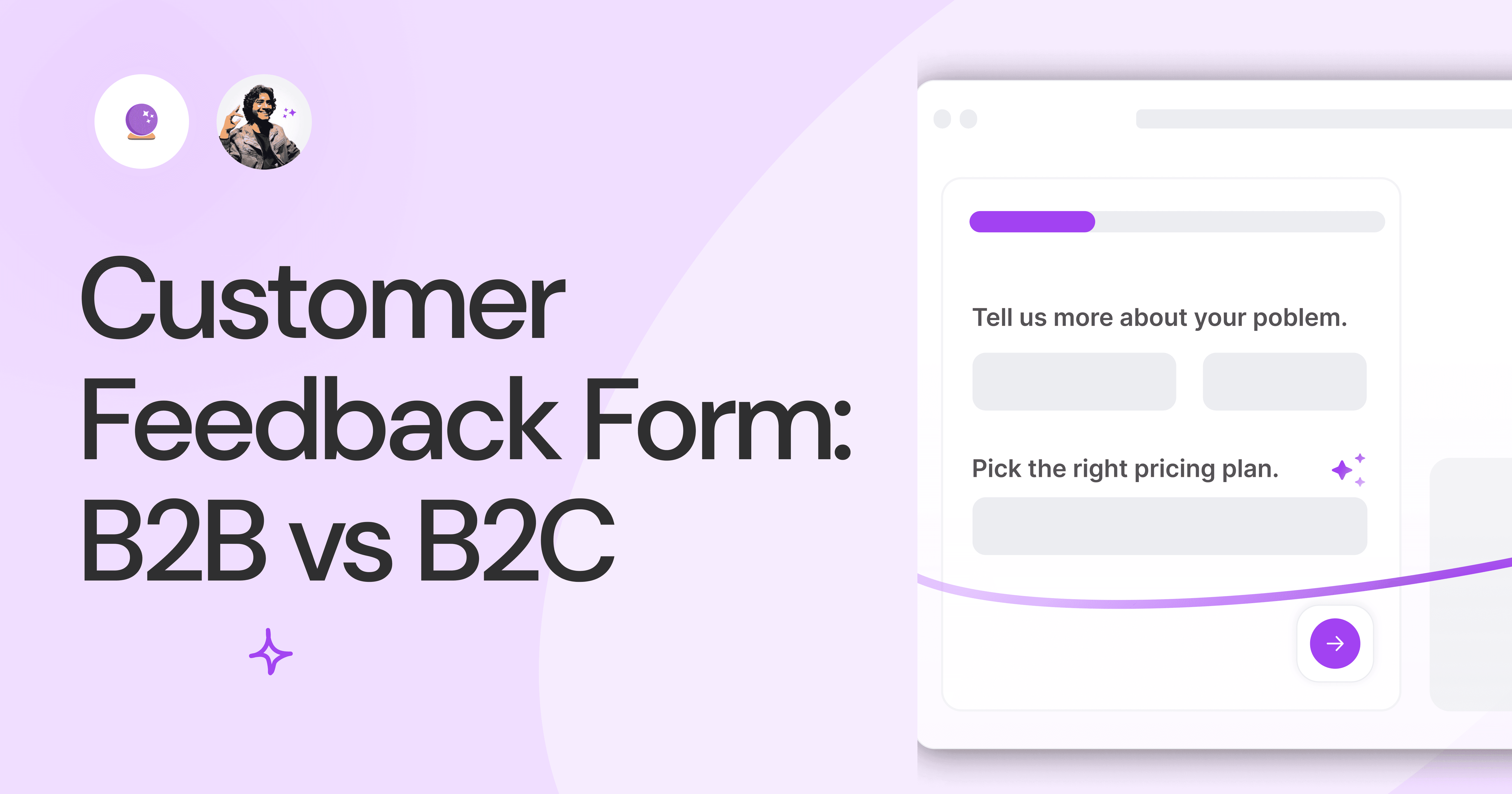
Customer Feedback Form: B2B vs B2C.
Why is customer feedback important? Because it dictates progress on B2B and B2B products and services for the customer to meet their goals.

SaaS Customer Feedback Form: 6 Main Types.
As much as SaaS is self-serve, the role of a customer feedback form is highly relevant. There are different types, each with its use case and sections.

Role of a Product Survey in SaaS.
SaaS is all about creating products for specific use cases. This is where a product survey becomes all the more important to know the user deeply.

Should You Do a SaaS Market Survey?
Every SaaS company wants to grow fast. But without a market survey, growth isn't possible or sustainable. Let’s see how to do a market survey.
SAAS Pricing Calculators: B2B v B2C Online Forms.
The SaaS pricing calculator is an essential tool for both B2B and B2C SaaS companies. But how do you build it, right? We have you covered.
B2B SaaS: Making Book a Demo Form.
Having the perfect book a demo form for B2B SaaS is the first step in capturing leads. There are a few fundamental techniques to get this form right. Read on.
How to Get Started With SaaS Onboarding.
SaaS onboarding is essential for customer onboarding in B2B and B2C SaaS. Let’s understand its fundamentals, including the metrics.
Customer Feedback Form: B2B vs B2C.
Why is customer feedback important? Because it dictates progress on B2B and B2B products and services for the customer to meet their goals.
SaaS Customer Feedback Form: 6 Main Types.
As much as SaaS is self-serve, the role of a customer feedback form is highly relevant. There are different types, each with its use case and sections.
Role of a Product Survey in SaaS.
SaaS is all about creating products for specific use cases. This is where a product survey becomes all the more important to know the user deeply.
Should You Do a SaaS Market Survey?
Every SaaS company wants to grow fast. But without a market survey, growth isn't possible or sustainable. Let’s see how to do a market survey.

Nine Types of Healthcare and Medical Forms.
Medical forms are a must-have for any healthcare business or practitioner. Learn about the different kinds of medical and healthcare forms.

4 Tips for Better Medical History Forms.
Medical history forms are central to patient care, onboarding, and medical administration records. Learn how to make them easier to fill.

How to Build Mental Health Intake Forms?
Mental health intake forms are not like patient intake forms. Mental health intake forms deal with far more sensitive data and have specific design methods.
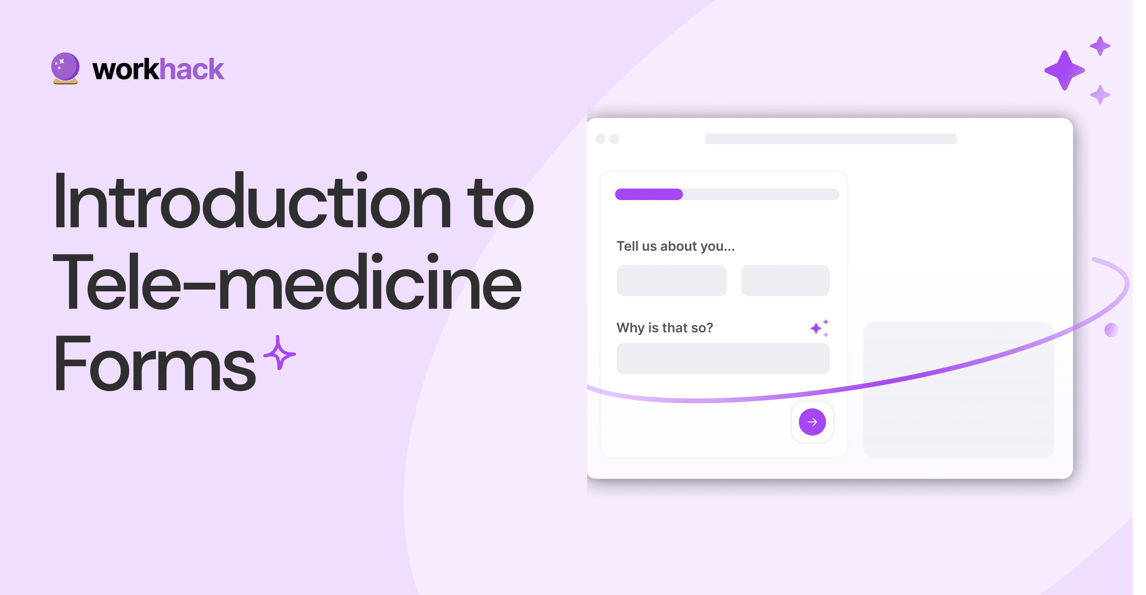
What, Why and How of Telemedicine Forms.
Telemedicine is on the rise and with different form builders out there, which one best suits your needs as a healthcare services provider?

3 Reasons for Major Drop-Offs in Medical Forms.
No matter which healthcare form we pick, there are major drop-off reasons. We shall dive into the top 3 and learn how to resolve them in your next form.

Patient Onboarding Forms - From Click to Clinic.
Patient onboarding forms are the first touchpoint for patients; getting this right for higher conversion rates is a must-have. Learn how to perfect them now.

5 Key Parts of a Good Patient Satisfaction Form.
The goal of patient satisfaction surveys is to course-correct the services of a healthcare provider. Patient feedback leads to a culture of patient-centric care.
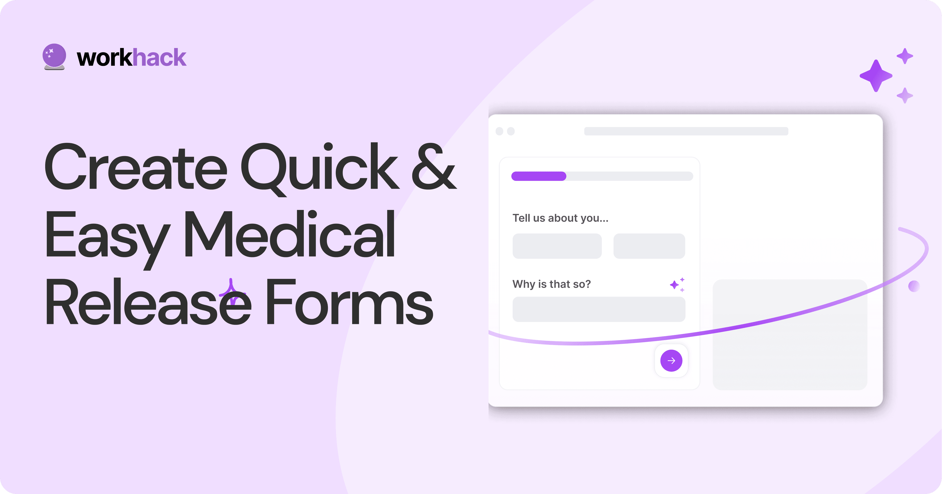
Build Quick and Easy Medical Release Forms.
Every HIPAA-compliant healthcare provider comes across medical release forms that involve details from medical history forms. Can they be shipped fast? Yes.
SAAS Pricing Calculators: B2B v B2C Online Forms.
The SaaS pricing calculator is an essential tool for both B2B and B2C SaaS companies. But how do you build it, right? We have you covered.
B2B SaaS: Making Book a Demo Form.
Having the perfect book a demo form for B2B SaaS is the first step in capturing leads. There are a few fundamental techniques to get this form right. Read on.
How to Get Started With SaaS Onboarding.
SaaS onboarding is essential for customer onboarding in B2B and B2C SaaS. Let’s understand its fundamentals, including the metrics.
Customer Feedback Form: B2B vs B2C.
Why is customer feedback important? Because it dictates progress on B2B and B2B products and services for the customer to meet their goals.
SaaS Customer Feedback Form: 6 Main Types.
As much as SaaS is self-serve, the role of a customer feedback form is highly relevant. There are different types, each with its use case and sections.
Role of a Product Survey in SaaS.
SaaS is all about creating products for specific use cases. This is where a product survey becomes all the more important to know the user deeply.
Should You Do a SaaS Market Survey?
Every SaaS company wants to grow fast. But without a market survey, growth isn't possible or sustainable. Let’s see how to do a market survey.

Subscribe to stay updated.
Subscribe to stay updated.
Subscribe to stay updated.
HC

HC

HC

HC

70+ people from across industries read our emails.
HC
HC
70+ people from across industries read our emails.
HC
HC
HC
70+ people from across industries read our emails.


Bangalore, India / San Francisco, US
WorkHack Inc. 2023


Bangalore, India
San Francisco, US
WorkHack Inc. 2023
WorkHack Inc. 2023
Bangalore, India / San Francisco, US
WorkHack Inc. 2023
Bangalore, India / San Francisco, US