
Tips and Practices for Form UI Design
Tips and Practices for Form UI Design
Tips and Practices for Form UI Design
Learn how to design forms that users love to fill out! Explores best practices for clear labeling, intuitive layouts that increase form completion rates.
Learn how to design forms that users love to fill out! Explores best practices for clear labeling, intuitive layouts that increase form completion rates.
Learn how to design forms that users love to fill out! Explores best practices for clear labeling, intuitive layouts that increase form completion rates.

“Every form is an opportunity to have a conversation with a customer”.
A poorly designed form interface (UI) can turn a simple task into a frustrating ordeal. Users often consider abandoning forms if they feel annoyed or dislike them due to various reasons, such as long lengths or poor design. This translates to lost leads, incomplete data, and ultimately, lost revenue.
But what if you could unlock the power of good form UI design?
Imagine creating forms that are not only functional but also user-friendly and engaging. This guide will show you how to transform your forms from data collection roadblocks into gateways to happy customers and valuable insights.
Get ready to discover the secrets of crafting form UIs that users will actually enjoy interacting with!
Design Fundamentals

Having established the importance of user experience (UX) in form design, let's delve into the core principles that form the foundation of user-friendly forms. These design fundamentals ensure clarity, efficiency, and a smooth user journey.
Minimize Fields and Clearly Mark Optional Ones:
Less is truly more! Every field you add increases the form's complexity and potential for abandonment. Identify the absolute minimum information you need and stick to it. Here are some tips to follow:
Ask yourself, "Is this information truly essential for my purpose?" If not, remove it.
Can you combine multiple fields into a single one? For example, instead of separate fields for street address, city, state, and zip code, consider a single "address" field with proper formatting guidance.
For forms targeting users in regions with standardized address formats, consider combining address-related fields where appropriate but remain mindful of global differences.If you have existing user data, pre-populate relevant fields to save users time and effort.
For optional fields, clearly mark them as such. This empowers users and reduces the feeling of being forced to provide unnecessary information.
Craft a Logical, Conversational Flow:
Imagine your form as a conversation. Questions should follow a natural order, guiding users towards completion without confusion. Here are some tips:
Begin with basic information and gradually progress towards more complex details.
Categorize questions logically. For example, group all billing information together.
Employ clear wording or visual cues to indicate when users are moving to a new section.
This conversational approach makes the form feel less intimidating and encourages users to keep moving forward.
Choose the Right Form Structure and Appearance for Efficiency:
Visual design and layout play a crucial role in user experience. Here's how to optimize your form's structure and appearance:
Opt for a single-column layout for optimal readability and ease of use, especially on mobile devices.
Don't crowd the form. Use ample white space to separate elements and create a visually clean experience.
Utilize different input field styles (text boxes, drop-down menus, etc.) to make it clear what kind of information each field requires.
By prioritizing a clear and efficient structure, you create a form that users can navigate intuitively and complete quickly.
Improving the User Experience

Having established a solid foundation, let's explore additional strategies to take your form's user experience (UX) to the next level:
Start with the Easiest Attributes to Encourage Form Completion:
People are more likely to complete a form if they feel a sense of progress early on. Start with the simplest and least time-consuming questions. This builds momentum and motivates users to keep going.
For example, if you're collecting contact information, begin with name and email address before moving on to more complex details.
Utilize Autofill and Smart Defaults for a Streamlined Experience:
Modern browsers and devices offer autofill features that can pre-populate forms with user information. Leverage this functionality to save users time and effort.
Additionally, consider implementing smart defaults by pre-selecting common options or filling in based on previous user input (with clear opt-out options). This streamlines the completion process and reduces the risk of errors.
Break Complex Forms into Manageable Steps:
Lengthy forms can be overwhelming. If your form has many fields, consider breaking it down into logical steps or sections. This creates a sense of accomplishment as users complete each step and keeps them focused on the task at hand.
Utilize progress bars or numbered steps to represent progress and motivate users to continue visually.
Tailor Forms in Real Time with Conditional Inputs Based on User Input (Advanced Technique):
Conditional logic can be a powerful tool for advanced users. It allows you to dynamically show or hide certain fields based on previous user input.
For example, if a user selects "Student" from a job title option, you can hide a field for "Years of experience" that might be relevant only for professionals.
This personalization reduces the number of fields users see upfront and creates a more relevant experience.
By implementing these strategies, you can significantly enhance your form's user experience, leading to higher completion rates, happier users, and valuable data collection.
Before diving into layout optimization, consider the transformative impact of AI in structuring your forms. With Metaforms, you can use AI insights to determine the most efficient form structures tailored to your audience.
Optimizing Form Layout and Field Arrangement:
Let’s straight away dive into how to optimize your form's layout and field arrangement for maximum usability:
Label Placement and Option Arrangement:
Labels above input fields provide clear context and guide users on what information is needed. Avoid placing labels to the left of fields, as this can be visually confusing.
For radio buttons, checkboxes, or dropdown menus with multiple options, arrange them vertically in a single column. This improves readability and reduces the need for horizontal scrolling on smaller screens.
Grouping Related Fields:
Divide fields into semantic groups: Don't present users with a long list of isolated questions. Group related fields together logically. For example, categorize all billing information under a "Billing Address" section. This reduces mental load and makes the form easier to navigate.
Field Width and Visual Constraints:
Utilize visual cues like borders or subtle shading to define the boundaries of each field. This helps users distinguish between separate input areas.
Don't create overly narrow fields for lengthy text entries. Consider the type of information each field requires and adjust the width accordingly. This ensures a smooth user experience without unnecessary frustration.
Clear Action Buttons and Navigation:
Provide clear action buttons: The user's goal should be evident. Use clear and concise labels for buttons like "Submit" or "Continue."
Logical navigation within the form: If your form has multiple steps or sections, ensure clear navigation options. Utilize "Next" and "Back" buttons or progress bars to guide users through the completion process.
By following these guidelines, you can create a form layout that is not only visually appealing but also intuitive and user-friendly. This translates to a smoother user experience and ultimately, higher completion rates.
Also read: Form Layout: Tips and Best Practices for User-Friendly Design
Enhancing Input Field Usability
Modify Input Types to Match the Data Being Collected. There's more to input fields than just text boxes! Utilize a variety of input types to match the specific data you're collecting. For example, use:
* Date pickers for selecting dates
* Dropdown menus for pre-defined options
* Radio buttons for selecting a single option from a limited set
* Checkboxes for selecting multiple options
Matching input types not only improves user experience but also reduces the risk of errors by guiding users towards the correct format.
Design for Field States and User Interactions with Visual cues:
Effective form design goes beyond static elements. Consider how the form will interact with users. Utilize visual cues to:
Clearly show when a field is empty, focused on, or has an error. This can be achieved through color changes, borders, or subtle animations.
Provide feedback on user interaction. For example, use subtle animations or color changes to acknowledge user actions like clicking on a checkbox or entering text.
These visual cues create a more interactive and user-friendly experience.
Offer Inline Hints and Validation to Clarify Input Field Requirements:
Don't wait until the end of the form to inform users of errors. Implement real-time validation that highlights mistakes as users enter data.
Additionally, consider offering inline hints or help text within the form itself to provide additional guidance on what information is required in each field. This proactive approach reduces frustration and ensures accurate data collection.
Use Appropriate Keyboard Type on Mobile for User Convenience:
In today's mobile-first world, optimizing for mobile devices is crucial. Utilize appropriate keyboard types on mobile devices.
For example, a numeric keyboard for phone number fields or an email keyboard for email addresses. This streamlines data entry and reduces the risk of typos on smaller screens.
By incorporating these subsections on input field usability, you can create a form that is not only clear and well-labeled but also interactive and user-friendly across all devices.
Copy and Messaging in Forms
We've explored the importance of design fundamentals, clear labeling, and user-friendly input fields. But another crucial element often gets overlooked: copy and messaging. The words you use throughout your form can significantly impact user experience (UX) and completion rates.
Effective copy is like a friendly guide, leading users through the form-filling process with clarity and ease. Conversely, poor messaging can create confusion, frustration, and ultimately, form abandonment.
Here's how to leverage the power of copy and messaging to create user-friendly forms:
Label Fields Clearly and Address User Concerns Promptly:
Clear labels are the foundation of a user-friendly form. But go beyond just stating what information is needed. Anticipate potential user concerns and address them directly within the label or through a tooltip.
For example, if a field requires a specific format (e.g., phone number), include that information within the label. This proactive approach reduces the need for users to stop and search for help.
Use Descriptive, Action-Based Words on Buttons and Avoid Using All-Caps:
Buttons are the call to action of your form. Don't settle for generic labels like "Submit" or "Next." Instead, use action-oriented verbs that clearly communicate the button's function.
For example, "Download Now" or "Continue to Checkout" are more descriptive and motivating.
Avoid using all caps for button text. While it might seem attention-grabbing, it can appear aggressive and is less readable.
Provide Feedback Through Confirmation Messages and Success States:
The user journey doesn't end after clicking submit. Provide clear confirmation messages or success states acknowledging form completion and informing users of what happens next. This feedback loop reinforces a positive user experience.
For example, a confirmation message thanking the user for submitting the form and letting them know they will receive a follow-up email is more informative than a simple "Thank You" page.
Make the Required Input Format Clear to Users:
Don't leave users guessing about how to format their input. Clearly communicate any specific requirements directly within the label or through inline hints.
For example, if a date field requires a specific format (e.g., MM/DD/YYYY), include that information within the label or provide a placeholder with an example.
By following these principles, you can craft copy and messaging that not only informs users but also guides them through the form-filling process with ease. This translates to a more positive user experience and ultimately, higher completion rates for your forms.
Form Validation and Usability
Having established the importance of clear design, user-friendly input fields, and compelling messaging, let's delve into the world of form validation. Validation ensures the accuracy and integrity of the data collected through your forms. However, it's crucial to achieve this without compromising user experience (UX).
Here's how to strike the perfect balance between form validation and usability:
Embrace Real-Time Feedback with Inline Validation:
Traditionally, forms only validated data after the submit button was clicked, leading to frustration if users encountered errors at the end. Prioritize inline validation. This approach checks user input as they type, highlighting errors or providing feedback in real-time. This allows users to correct mistakes immediately, avoiding the need to start over.
Craft Helpful Error Messages, Not Obstacles:
Error messages are inevitable, but they shouldn't be roadblocks. Instead of generic messages like "Invalid Input," provide clear and specific guidance on how to fix the error.
For example, if a user enters an invalid email address, the error message could suggest a proper format (e.g., "Please enter a valid email address like [email address removed]"). Helpful error messages empower users to resolve issues quickly and keep them moving forward.
Prevent Data Issues with Submission Validation:
While inline validation catches most errors, a final layer of validation at submission is still important. This safeguards data integrity by ensuring all required fields are filled correctly before the form is submitted.
However, there's a way to do this without creating frustration. While disabling the submit button can guide users to rectify errors, ensure immediate and clear feedback is provided for incomplete or incorrectly filled fields to avoid confusion and frustration.
By implementing these strategies, you can create a form validation system that promotes data accuracy without hindering the user experience.
Testing and Optimization
We've covered a wealth of information on crafting user-friendly forms, from design fundamentals to the power of copywriting. But the journey doesn't end there. Testing and optimization are crucial for ensuring your form functions flawlessly and delivers an exceptional user experience (UX).
Here's how to refine your form for optimal performance:
Testing Across Devices and Browsers:
Test on all major browsers: Compatibility is key. Ensure your form displays and functions correctly across all major web browsers (Chrome, Firefox, Safari, etc.). This guarantees a seamless experience for a wider audience.
Prioritize mobile-friendliness: In today's mobile-first world, optimizing your form for smartphones and tablets is essential. Test the form on various mobile devices and screen sizes to ensure proper formatting and easy interaction.
A/B Testing and User Feedback:
Don't settle for assumptions! A/B testing allows you to compare different versions of your form elements (e.g., button placement, label wording) and see which ones lead to higher completion rates. This data-driven approach helps you identify the most user-friendly design choices.
While internal testing is valuable, incorporating real user feedback is crucial. Conduct usability testing sessions with target users to observe their interactions with the form and gather their insights. This can reveal issues you might have missed and provide valuable guidance for improvement.
Performance Optimization:
Form loading times can significantly impact user experience. Test your form's loading speed and identify any bottlenecks. Optimize images, minimize code, and consider using a Content Delivery Network (CDN) to improve delivery speed.
By following these testing and optimization best practices, you can ensure your form not only functions flawlessly but also delivers a smooth and positive experience for all users. This translates to higher completion rates, valuable data collection, and a positive brand perception.
“Every form is an opportunity to have a conversation with a customer”.
A poorly designed form interface (UI) can turn a simple task into a frustrating ordeal. Users often consider abandoning forms if they feel annoyed or dislike them due to various reasons, such as long lengths or poor design. This translates to lost leads, incomplete data, and ultimately, lost revenue.
But what if you could unlock the power of good form UI design?
Imagine creating forms that are not only functional but also user-friendly and engaging. This guide will show you how to transform your forms from data collection roadblocks into gateways to happy customers and valuable insights.
Get ready to discover the secrets of crafting form UIs that users will actually enjoy interacting with!
Design Fundamentals
Having established the importance of user experience (UX) in form design, let's delve into the core principles that form the foundation of user-friendly forms. These design fundamentals ensure clarity, efficiency, and a smooth user journey.
Minimize Fields and Clearly Mark Optional Ones:
Less is truly more! Every field you add increases the form's complexity and potential for abandonment. Identify the absolute minimum information you need and stick to it. Here are some tips to follow:
Ask yourself, "Is this information truly essential for my purpose?" If not, remove it.
Can you combine multiple fields into a single one? For example, instead of separate fields for street address, city, state, and zip code, consider a single "address" field with proper formatting guidance.
For forms targeting users in regions with standardized address formats, consider combining address-related fields where appropriate but remain mindful of global differences.If you have existing user data, pre-populate relevant fields to save users time and effort.
For optional fields, clearly mark them as such. This empowers users and reduces the feeling of being forced to provide unnecessary information.
Craft a Logical, Conversational Flow:
Imagine your form as a conversation. Questions should follow a natural order, guiding users towards completion without confusion. Here are some tips:
Begin with basic information and gradually progress towards more complex details.
Categorize questions logically. For example, group all billing information together.
Employ clear wording or visual cues to indicate when users are moving to a new section.
This conversational approach makes the form feel less intimidating and encourages users to keep moving forward.
Choose the Right Form Structure and Appearance for Efficiency:
Visual design and layout play a crucial role in user experience. Here's how to optimize your form's structure and appearance:
Opt for a single-column layout for optimal readability and ease of use, especially on mobile devices.
Don't crowd the form. Use ample white space to separate elements and create a visually clean experience.
Utilize different input field styles (text boxes, drop-down menus, etc.) to make it clear what kind of information each field requires.
By prioritizing a clear and efficient structure, you create a form that users can navigate intuitively and complete quickly.
Improving the User Experience
Having established a solid foundation, let's explore additional strategies to take your form's user experience (UX) to the next level:
Start with the Easiest Attributes to Encourage Form Completion:
People are more likely to complete a form if they feel a sense of progress early on. Start with the simplest and least time-consuming questions. This builds momentum and motivates users to keep going.
For example, if you're collecting contact information, begin with name and email address before moving on to more complex details.
Utilize Autofill and Smart Defaults for a Streamlined Experience:
Modern browsers and devices offer autofill features that can pre-populate forms with user information. Leverage this functionality to save users time and effort.
Additionally, consider implementing smart defaults by pre-selecting common options or filling in based on previous user input (with clear opt-out options). This streamlines the completion process and reduces the risk of errors.
Break Complex Forms into Manageable Steps:
Lengthy forms can be overwhelming. If your form has many fields, consider breaking it down into logical steps or sections. This creates a sense of accomplishment as users complete each step and keeps them focused on the task at hand.
Utilize progress bars or numbered steps to represent progress and motivate users to continue visually.
Tailor Forms in Real Time with Conditional Inputs Based on User Input (Advanced Technique):
Conditional logic can be a powerful tool for advanced users. It allows you to dynamically show or hide certain fields based on previous user input.
For example, if a user selects "Student" from a job title option, you can hide a field for "Years of experience" that might be relevant only for professionals.
This personalization reduces the number of fields users see upfront and creates a more relevant experience.
By implementing these strategies, you can significantly enhance your form's user experience, leading to higher completion rates, happier users, and valuable data collection.
Before diving into layout optimization, consider the transformative impact of AI in structuring your forms. With Metaforms, you can use AI insights to determine the most efficient form structures tailored to your audience.
Optimizing Form Layout and Field Arrangement:
Let’s straight away dive into how to optimize your form's layout and field arrangement for maximum usability:
Label Placement and Option Arrangement:
Labels above input fields provide clear context and guide users on what information is needed. Avoid placing labels to the left of fields, as this can be visually confusing.
For radio buttons, checkboxes, or dropdown menus with multiple options, arrange them vertically in a single column. This improves readability and reduces the need for horizontal scrolling on smaller screens.
Grouping Related Fields:
Divide fields into semantic groups: Don't present users with a long list of isolated questions. Group related fields together logically. For example, categorize all billing information under a "Billing Address" section. This reduces mental load and makes the form easier to navigate.
Field Width and Visual Constraints:
Utilize visual cues like borders or subtle shading to define the boundaries of each field. This helps users distinguish between separate input areas.
Don't create overly narrow fields for lengthy text entries. Consider the type of information each field requires and adjust the width accordingly. This ensures a smooth user experience without unnecessary frustration.
Clear Action Buttons and Navigation:
Provide clear action buttons: The user's goal should be evident. Use clear and concise labels for buttons like "Submit" or "Continue."
Logical navigation within the form: If your form has multiple steps or sections, ensure clear navigation options. Utilize "Next" and "Back" buttons or progress bars to guide users through the completion process.
By following these guidelines, you can create a form layout that is not only visually appealing but also intuitive and user-friendly. This translates to a smoother user experience and ultimately, higher completion rates.
Also read: Form Layout: Tips and Best Practices for User-Friendly Design
Enhancing Input Field Usability
Modify Input Types to Match the Data Being Collected. There's more to input fields than just text boxes! Utilize a variety of input types to match the specific data you're collecting. For example, use:
* Date pickers for selecting dates
* Dropdown menus for pre-defined options
* Radio buttons for selecting a single option from a limited set
* Checkboxes for selecting multiple options
Matching input types not only improves user experience but also reduces the risk of errors by guiding users towards the correct format.
Design for Field States and User Interactions with Visual cues:
Effective form design goes beyond static elements. Consider how the form will interact with users. Utilize visual cues to:
Clearly show when a field is empty, focused on, or has an error. This can be achieved through color changes, borders, or subtle animations.
Provide feedback on user interaction. For example, use subtle animations or color changes to acknowledge user actions like clicking on a checkbox or entering text.
These visual cues create a more interactive and user-friendly experience.
Offer Inline Hints and Validation to Clarify Input Field Requirements:
Don't wait until the end of the form to inform users of errors. Implement real-time validation that highlights mistakes as users enter data.
Additionally, consider offering inline hints or help text within the form itself to provide additional guidance on what information is required in each field. This proactive approach reduces frustration and ensures accurate data collection.
Use Appropriate Keyboard Type on Mobile for User Convenience:
In today's mobile-first world, optimizing for mobile devices is crucial. Utilize appropriate keyboard types on mobile devices.
For example, a numeric keyboard for phone number fields or an email keyboard for email addresses. This streamlines data entry and reduces the risk of typos on smaller screens.
By incorporating these subsections on input field usability, you can create a form that is not only clear and well-labeled but also interactive and user-friendly across all devices.
Copy and Messaging in Forms
We've explored the importance of design fundamentals, clear labeling, and user-friendly input fields. But another crucial element often gets overlooked: copy and messaging. The words you use throughout your form can significantly impact user experience (UX) and completion rates.
Effective copy is like a friendly guide, leading users through the form-filling process with clarity and ease. Conversely, poor messaging can create confusion, frustration, and ultimately, form abandonment.
Here's how to leverage the power of copy and messaging to create user-friendly forms:
Label Fields Clearly and Address User Concerns Promptly:
Clear labels are the foundation of a user-friendly form. But go beyond just stating what information is needed. Anticipate potential user concerns and address them directly within the label or through a tooltip.
For example, if a field requires a specific format (e.g., phone number), include that information within the label. This proactive approach reduces the need for users to stop and search for help.
Use Descriptive, Action-Based Words on Buttons and Avoid Using All-Caps:
Buttons are the call to action of your form. Don't settle for generic labels like "Submit" or "Next." Instead, use action-oriented verbs that clearly communicate the button's function.
For example, "Download Now" or "Continue to Checkout" are more descriptive and motivating.
Avoid using all caps for button text. While it might seem attention-grabbing, it can appear aggressive and is less readable.
Provide Feedback Through Confirmation Messages and Success States:
The user journey doesn't end after clicking submit. Provide clear confirmation messages or success states acknowledging form completion and informing users of what happens next. This feedback loop reinforces a positive user experience.
For example, a confirmation message thanking the user for submitting the form and letting them know they will receive a follow-up email is more informative than a simple "Thank You" page.
Make the Required Input Format Clear to Users:
Don't leave users guessing about how to format their input. Clearly communicate any specific requirements directly within the label or through inline hints.
For example, if a date field requires a specific format (e.g., MM/DD/YYYY), include that information within the label or provide a placeholder with an example.
By following these principles, you can craft copy and messaging that not only informs users but also guides them through the form-filling process with ease. This translates to a more positive user experience and ultimately, higher completion rates for your forms.
Form Validation and Usability
Having established the importance of clear design, user-friendly input fields, and compelling messaging, let's delve into the world of form validation. Validation ensures the accuracy and integrity of the data collected through your forms. However, it's crucial to achieve this without compromising user experience (UX).
Here's how to strike the perfect balance between form validation and usability:
Embrace Real-Time Feedback with Inline Validation:
Traditionally, forms only validated data after the submit button was clicked, leading to frustration if users encountered errors at the end. Prioritize inline validation. This approach checks user input as they type, highlighting errors or providing feedback in real-time. This allows users to correct mistakes immediately, avoiding the need to start over.
Craft Helpful Error Messages, Not Obstacles:
Error messages are inevitable, but they shouldn't be roadblocks. Instead of generic messages like "Invalid Input," provide clear and specific guidance on how to fix the error.
For example, if a user enters an invalid email address, the error message could suggest a proper format (e.g., "Please enter a valid email address like [email address removed]"). Helpful error messages empower users to resolve issues quickly and keep them moving forward.
Prevent Data Issues with Submission Validation:
While inline validation catches most errors, a final layer of validation at submission is still important. This safeguards data integrity by ensuring all required fields are filled correctly before the form is submitted.
However, there's a way to do this without creating frustration. While disabling the submit button can guide users to rectify errors, ensure immediate and clear feedback is provided for incomplete or incorrectly filled fields to avoid confusion and frustration.
By implementing these strategies, you can create a form validation system that promotes data accuracy without hindering the user experience.
Testing and Optimization
We've covered a wealth of information on crafting user-friendly forms, from design fundamentals to the power of copywriting. But the journey doesn't end there. Testing and optimization are crucial for ensuring your form functions flawlessly and delivers an exceptional user experience (UX).
Here's how to refine your form for optimal performance:
Testing Across Devices and Browsers:
Test on all major browsers: Compatibility is key. Ensure your form displays and functions correctly across all major web browsers (Chrome, Firefox, Safari, etc.). This guarantees a seamless experience for a wider audience.
Prioritize mobile-friendliness: In today's mobile-first world, optimizing your form for smartphones and tablets is essential. Test the form on various mobile devices and screen sizes to ensure proper formatting and easy interaction.
A/B Testing and User Feedback:
Don't settle for assumptions! A/B testing allows you to compare different versions of your form elements (e.g., button placement, label wording) and see which ones lead to higher completion rates. This data-driven approach helps you identify the most user-friendly design choices.
While internal testing is valuable, incorporating real user feedback is crucial. Conduct usability testing sessions with target users to observe their interactions with the form and gather their insights. This can reveal issues you might have missed and provide valuable guidance for improvement.
Performance Optimization:
Form loading times can significantly impact user experience. Test your form's loading speed and identify any bottlenecks. Optimize images, minimize code, and consider using a Content Delivery Network (CDN) to improve delivery speed.
By following these testing and optimization best practices, you can ensure your form not only functions flawlessly but also delivers a smooth and positive experience for all users. This translates to higher completion rates, valuable data collection, and a positive brand perception.

SAAS Pricing Calculators: B2B v B2C Online Forms.
The SaaS pricing calculator is an essential tool for both B2B and B2C SaaS companies. But how do you build it, right? We have you covered.

B2B SaaS: Making Book a Demo Form.
Having the perfect book a demo form for B2B SaaS is the first step in capturing leads. There are a few fundamental techniques to get this form right. Read on.

How to Get Started With SaaS Onboarding.
SaaS onboarding is essential for customer onboarding in B2B and B2C SaaS. Let’s understand its fundamentals, including the metrics.
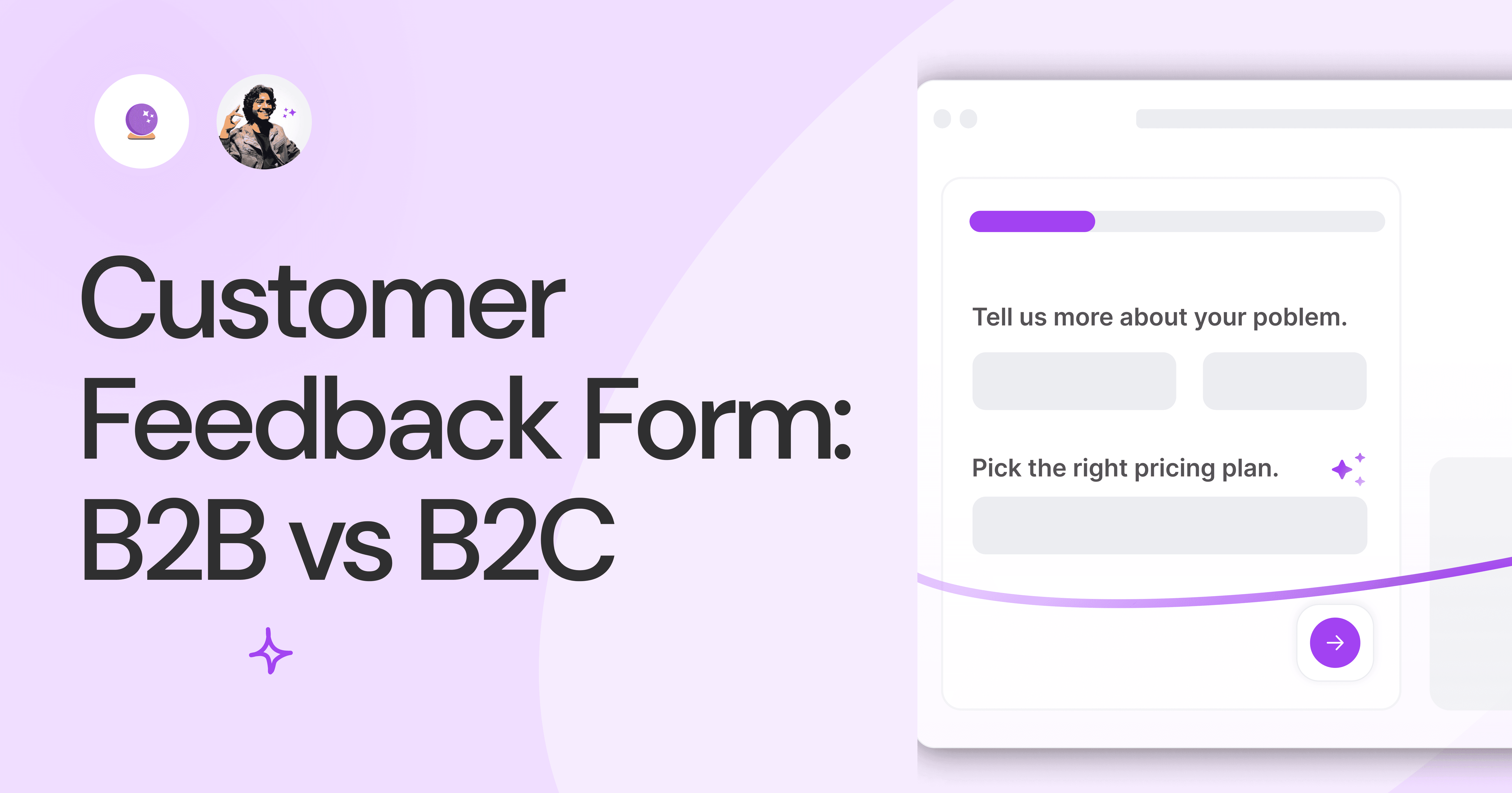
Customer Feedback Form: B2B vs B2C.
Why is customer feedback important? Because it dictates progress on B2B and B2B products and services for the customer to meet their goals.

SaaS Customer Feedback Form: 6 Main Types.
As much as SaaS is self-serve, the role of a customer feedback form is highly relevant. There are different types, each with its use case and sections.

Role of a Product Survey in SaaS.
SaaS is all about creating products for specific use cases. This is where a product survey becomes all the more important to know the user deeply.

Should You Do a SaaS Market Survey?
Every SaaS company wants to grow fast. But without a market survey, growth isn't possible or sustainable. Let’s see how to do a market survey.
SAAS Pricing Calculators: B2B v B2C Online Forms.
The SaaS pricing calculator is an essential tool for both B2B and B2C SaaS companies. But how do you build it, right? We have you covered.
B2B SaaS: Making Book a Demo Form.
Having the perfect book a demo form for B2B SaaS is the first step in capturing leads. There are a few fundamental techniques to get this form right. Read on.
How to Get Started With SaaS Onboarding.
SaaS onboarding is essential for customer onboarding in B2B and B2C SaaS. Let’s understand its fundamentals, including the metrics.
Customer Feedback Form: B2B vs B2C.
Why is customer feedback important? Because it dictates progress on B2B and B2B products and services for the customer to meet their goals.
SaaS Customer Feedback Form: 6 Main Types.
As much as SaaS is self-serve, the role of a customer feedback form is highly relevant. There are different types, each with its use case and sections.
Role of a Product Survey in SaaS.
SaaS is all about creating products for specific use cases. This is where a product survey becomes all the more important to know the user deeply.
Should You Do a SaaS Market Survey?
Every SaaS company wants to grow fast. But without a market survey, growth isn't possible or sustainable. Let’s see how to do a market survey.

Nine Types of Healthcare and Medical Forms.
Medical forms are a must-have for any healthcare business or practitioner. Learn about the different kinds of medical and healthcare forms.

4 Tips for Better Medical History Forms.
Medical history forms are central to patient care, onboarding, and medical administration records. Learn how to make them easier to fill.

How to Build Mental Health Intake Forms?
Mental health intake forms are not like patient intake forms. Mental health intake forms deal with far more sensitive data and have specific design methods.
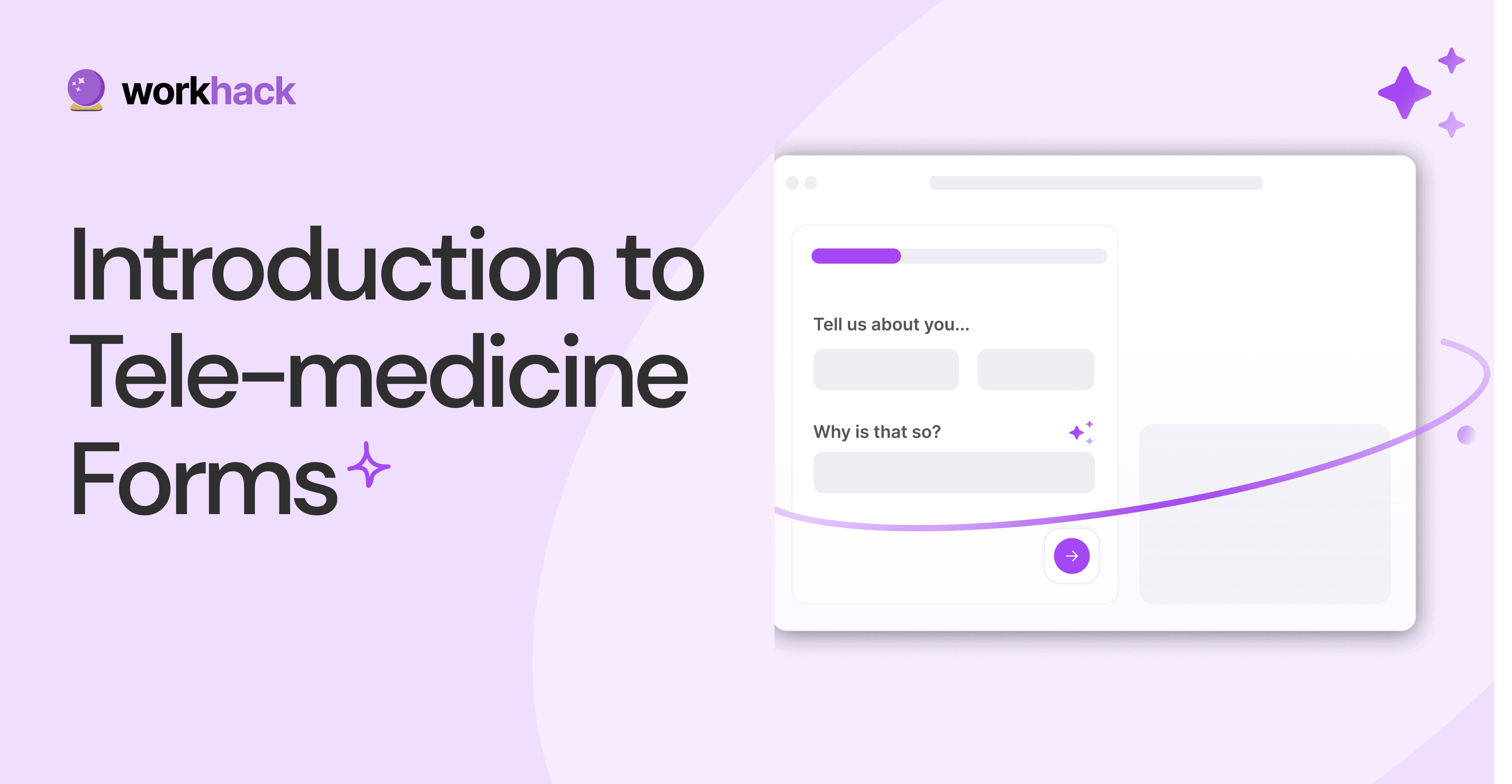
What, Why and How of Telemedicine Forms.
Telemedicine is on the rise and with different form builders out there, which one best suits your needs as a healthcare services provider?

3 Reasons for Major Drop-Offs in Medical Forms.
No matter which healthcare form we pick, there are major drop-off reasons. We shall dive into the top 3 and learn how to resolve them in your next form.

Patient Onboarding Forms - From Click to Clinic.
Patient onboarding forms are the first touchpoint for patients; getting this right for higher conversion rates is a must-have. Learn how to perfect them now.

5 Key Parts of a Good Patient Satisfaction Form.
The goal of patient satisfaction surveys is to course-correct the services of a healthcare provider. Patient feedback leads to a culture of patient-centric care.
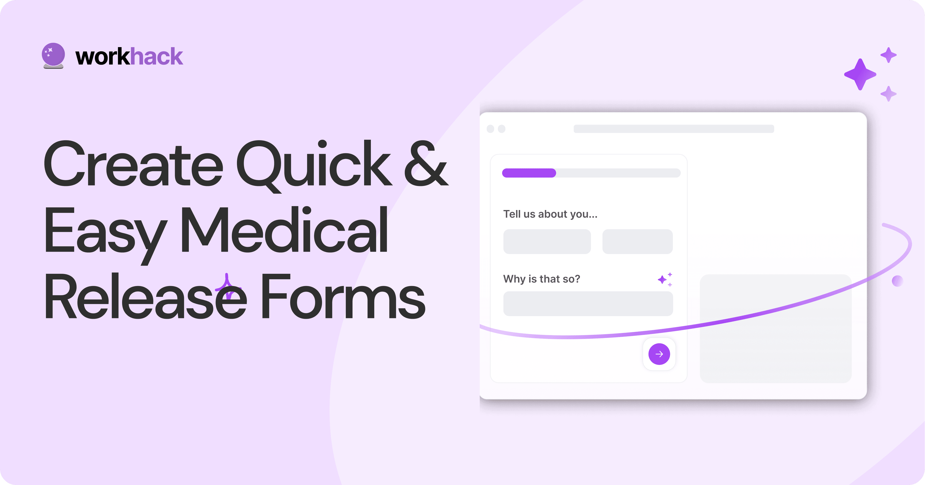
Build Quick and Easy Medical Release Forms.
Every HIPAA-compliant healthcare provider comes across medical release forms that involve details from medical history forms. Can they be shipped fast? Yes.
SAAS Pricing Calculators: B2B v B2C Online Forms.
The SaaS pricing calculator is an essential tool for both B2B and B2C SaaS companies. But how do you build it, right? We have you covered.
B2B SaaS: Making Book a Demo Form.
Having the perfect book a demo form for B2B SaaS is the first step in capturing leads. There are a few fundamental techniques to get this form right. Read on.
How to Get Started With SaaS Onboarding.
SaaS onboarding is essential for customer onboarding in B2B and B2C SaaS. Let’s understand its fundamentals, including the metrics.
Customer Feedback Form: B2B vs B2C.
Why is customer feedback important? Because it dictates progress on B2B and B2B products and services for the customer to meet their goals.
SaaS Customer Feedback Form: 6 Main Types.
As much as SaaS is self-serve, the role of a customer feedback form is highly relevant. There are different types, each with its use case and sections.
Role of a Product Survey in SaaS.
SaaS is all about creating products for specific use cases. This is where a product survey becomes all the more important to know the user deeply.
Should You Do a SaaS Market Survey?
Every SaaS company wants to grow fast. But without a market survey, growth isn't possible or sustainable. Let’s see how to do a market survey.

Subscribe to stay updated.
Subscribe to stay updated.
Subscribe to stay updated.
HC

HC

HC

HC

70+ people from across industries read our emails.
HC
HC
70+ people from across industries read our emails.
HC
HC
HC
70+ people from across industries read our emails.


Bangalore, India / San Francisco, US
WorkHack Inc. 2023


Bangalore, India
San Francisco, US
WorkHack Inc. 2023
WorkHack Inc. 2023
Bangalore, India / San Francisco, US
WorkHack Inc. 2023
Bangalore, India / San Francisco, US