
40+ Form Design Inspiration Ideas and Best Practices
40+ Form Design Inspiration Ideas and Best Practices
40+ Form Design Inspiration Ideas and Best Practices
Want people to actually fill out your forms? Learn how to create user-friendly forms that are clear, concise, and explore 40+ form design insiprations.
Want people to actually fill out your forms? Learn how to create user-friendly forms that are clear, concise, and explore 40+ form design insiprations.
Want people to actually fill out your forms? Learn how to create user-friendly forms that are clear, concise, and explore 40+ form design insiprations.

Ugh, forms! We've all been there.
You're excited to sign up for a free trial, download an ebook, or enter a contest, but then you hit that dreaded form. It seems endless, the instructions are unclear, and halfway through, you just want to slam your laptop shut.
Believe it or not, creating forms that frustrate users is a surprisingly common mistake. A study reveales that over 73% of people ditch forms because they're too complicated or long. That's a huge pool of potential customers or leads disappearing into the internet abyss, all because of a bad form design.
But hey, there's good news too!
Forms don't have to be the enemy. By understanding how users think and what makes a form user-friendly, you can create forms that are actually enjoyable to fill out.
This “40+ Form Design Inspiration Ideas and Best Practices” guide will show you the secrets to crafting forms that are clear, concise, and even (dare we say) fun to complete. Get ready to see your conversion rates soar and those abandoned forms become a thing of the past!
Why Forms Matter (and How They Can Be Better)

Good form design directly impacts your business goals. Users have limited patience and get easily confused by complexity. Studies show that unclear instructions, excessive form fields, and confusing layouts are all major contributors to form abandonment.
So, forms aren't the enemy – they're just misunderstood.
They're the gateway to capturing leads, closing deals, and building relationships with your audience. But just like that first date you meticulously planned, a poorly designed form can leave a bad impression and send potential customers running for the hills.
By understanding how users think and implementing some key best practices, you can transform your forms from formidable foes into digital BFFs. We'll show you how to create forms that are clear, concise, and even enjoyable to complete.
Recent Trends in Form Design
The world of form design is constantly evolving, with new trends emerging to improve user experience and increase completion rates. Here are some key trends.
Focus on User Experience (UX) First
Gone are the days of prioritizing functionality over user experience. Today's forms are designed with the user in mind. This means prioritizing clarity, ease of use, and a mobile-first approach.
A study by UserTesting found that a 70% improvement in task completion rates can be achieved by simply focusing on user experience. Metaforms echoes this sentiment, emphasizing the importance of creating forms that are intuitive and easy to navigate for all users.
Minimalism and Clean Design
Clean layouts, uncluttered interfaces, and clear labeling are all the rage in form design. Users appreciate forms that are easy to scan and understand at a glance. Formstack conducted a survey revealing that 64% of users find forms with clear and concise instructions more trustworthy.
Conditional Logic
Smart forms that adapt based on user input can significantly reduce form length and improve completion rates. Imagine a form that only asks for your city and state if you select "United States" as your country.
This personalization reduces friction and keeps users engaged by showing them only the relevant information they need to provide.
Progress Bars and Step-by-Step Layouts
Letting users know how far they've progressed through a form helps reduce abandonment rates. Step-by-step layouts make the process feel less daunting and provide users with a clear understanding of how much longer it will take to complete the form.
Rise of AI Forms
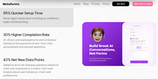
A recent innovation in form design is the emergence of AI-powered forms. These forms leverage artificial intelligence to automate tasks, personalize the user experience, and improve data collection accuracy. Here are some ways AI is being implemented in forms:
AI-powered Question Generation: AI can analyze your form's purpose and target audience to generate relevant and engaging questions automatically. This can save you time and effort in form creation.
Smart Autocomplete: AI can suggest answers to users as they type, reducing errors and speeding up the completion process.
Conversational Forms: These AI-powered forms mimic natural conversation, making the experience more user-friendly and engaging.
While AI forms are still a relatively new development, they hold promise for the future of form design. Metaform itself offers an AI Form Builder that utilizes some of these functionalities, allowing you to create intelligent forms that streamline data collection and improve user experience.
Components of a Form
A well-designed form is like a well-crafted recipe – each element plays a crucial role in the overall experience. Here are the key components to consider:
Form Fields: This is where users enter their information. Choose appropriate field types (text boxes, drop-down menus, radio buttons) based on the data you need to collect. Keep the number of fields to a minimum, only asking for what's truly necessary.
Clear Labels and Instructions: Use concise and easy-to-understand language for all labels and instructions. Avoid jargon and technical terms that your audience might not understand.
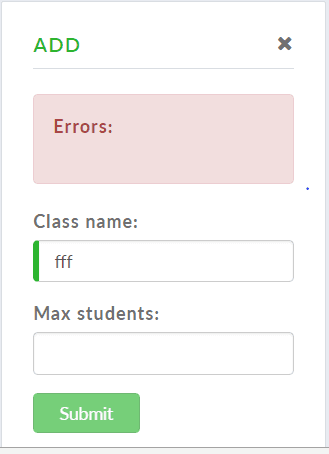
Error Handling and Validation: Implement error messages that are clear, specific, and actionable. Help users correct mistakes easily without frustration.
Call to Action: Clearly state what users should do after completing the form ("Submit," "Continue," etc.).
Psychology of Forms
Understanding user psychology is vital for creating forms that people actually enjoy completing.
People have limited attention spans online. Keep forms concise and visually appealing to avoid overwhelming users.
The form requires minimal mental effort to complete. Clear instructions, logical flow, and appropriate field types all contribute to a smooth experience.
Friction refers to any obstacle that prevents users from completing a form. Unclear instructions, excessive fields, and poor mobile responsiveness all create friction.
Use positive language and acknowledge successful form completion with a clear thank you message.
Audience, Purpose, and Context
The best forms are tailored to their specific audience, purpose, and context.
The first thing to consider is your audience!
Who are you trying to reach with this form?
Tailor the language, complexity, and overall design to resonate with your target audience.
What is the Purpose of your form?
What information are you trying to collect? Align the form fields and structure with your specific data collection goals.
What’s the Context?
Where will users encounter this form?
Is it embedded on a website, sent via email, or used for a specific event?
Optimize the form's design for the context in which it will be used.
Form Design Inspiration Ideas and Best Practices
Now that you're armed with the knowledge of essential components, user psychology, and audience considerations, it's time to translate that knowledge into action!
Form Layout
The form layout you choose for your form plays a significant role in how users interact with it. Let's look at them one by one.
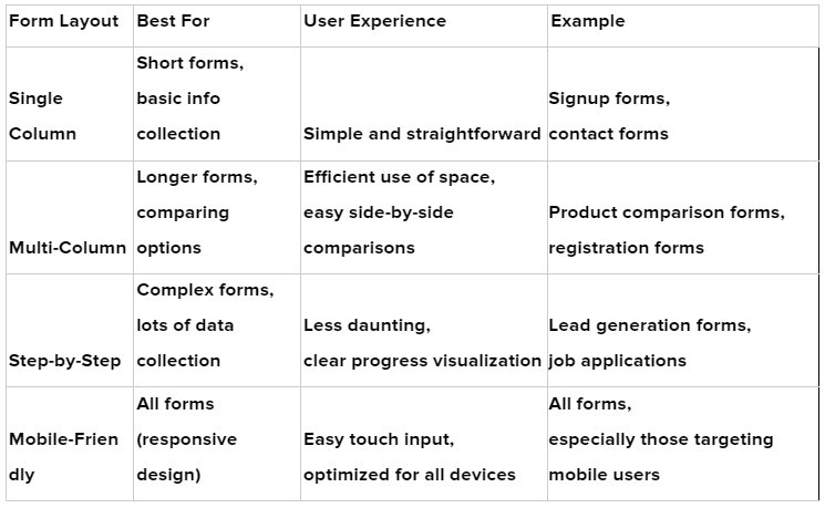
1. Single-Column Forms
This is the simplest and most common layout, with all questions stacked vertically one after another. It's ideal for short forms or forms collecting basic information.
2. Multi-Column Forms
This layout allows you to distribute questions across multiple columns, which can be useful for longer forms or forms requiring users to compare options side-by-side. However, be mindful of using too many columns, as it can overwhelm users on smaller screens.
3. Step-by-Step Forms
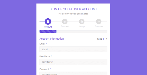
This layout breaks down the form into distinct steps or sections, making the completion process feel less daunting. Progress bars can be added alongside each step to provide users with a visual cue of their progress. This layout is ideal for complex forms or those collecting a significant amount of data.
4. Mobile-Friendly Forms
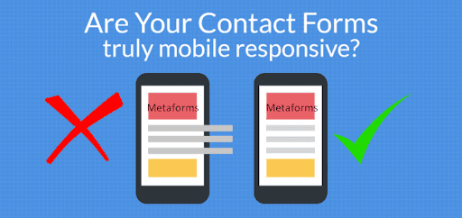
With a significant portion of users accessing forms on mobile devices, ensuring a mobile-friendly layout is crucial. This means using responsive design principles, larger form fields for easy touch input, and avoiding complex layouts that might not render well on smaller screens.
Here’s a snapshot of finding the right form layout for your business needs!
Form Elements
The specific elements you choose will depend on the type of information you're trying to collect.
5. Input Fields and Text Areas
These are the workhorses of any form, allowing users to enter text data. Text fields are ideal for short entries like names or email addresses, while text areas are suited for longer responses or descriptions.
6. Dropdowns and Select Boxes
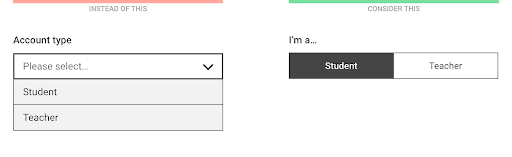
These elements present users with a list of pre-defined options from which they can choose one. They're useful for situations where there are a limited number of fixed choices, like selecting a country from a list.
7. Radio Buttons and Checkboxes
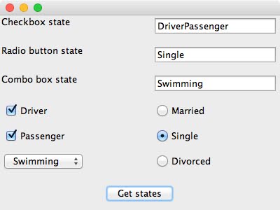
Radio buttons allow users to select only one option from a group of mutually exclusive choices (e.g., choosing a preferred payment method). Checkboxes, on the other hand, allow users to select multiple options from a list (e.g., selecting areas of interest).
8. Toggle Switches
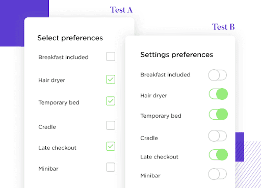
These function similarly to the on/off switch you might find on an appliance. They provide a simple way for users to make quick binary choices within your form.
Imagine enabling or disabling a notification setting with a single click on a toggle switch.
9. Button Styles
These are the clickable buttons that users press to submit the form or navigate through different stages within the form itself.
Ensure the button labels are clear and concise, like "Submit" or "Next," so users understand what action will be triggered upon clicking.
You can also experiment with different button styles to enhance the overall visual appeal of your form.
10. File Uploads
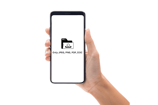
File upload fields allow users to submit resumes, images, documents, or any other relevant files directly through your form. Most form builders offer a dedicated file upload field where users can browse their device and select the files they want to submit.
To ensure a smooth experience, clearly specify accepted file types (e.g., .pdf, .docx, .jpg) to avoid compatibility issues. Additionally, setting a maximum file size limitation helps prevent overloaded servers and guarantees faster upload times.
Consider providing visual progress indicators, especially for larger files, to keep users informed about the upload status.
11. Date Pickers and Calendars
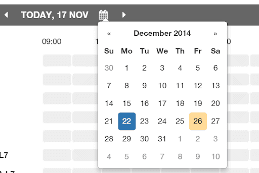
Collecting date information doesn't have to be a struggle! Date pickers and calendar widgets simplify the selection process by offering a visual calendar interface.
Gone are the days of manual date entry, minimizing typos and improving data accuracy. Many form creation tools provide date picker elements. Users simply click on a calendar icon and visually choose their desired date.
To further enhance the user experience, you can pre-populate the date picker with a default range or preferred selection, saving users time.
Additionally, consider offering calendar customization options like highlighting weekends, specific dates, or date ranges to guide users towards the relevant selections.
Choosing the Right Element depends upon:
Type of Data: Match the element to the type of data you're collecting. Text fields for names, dropdowns for countries, radio buttons for preferred options, and so on.
Number of Choices: If there are a limited number of fixed options, use dropdowns or radio buttons. For multiple selections, checkboxes are the way to go.
Clarity and Ease of Use: Prioritize clear labels and intuitive functionality for each element.
Form Validation and Feedback
Ensuring users enter the correct information and guiding them through the completion process is essential for a positive form experience. Here's how to implement effective validation and feedback mechanisms:
12. Inline Validation
This involves providing real-time feedback to users as they enter data. For example, highlighting an incorrectly formatted email address or indicating a missing required field. Inline validation helps users identify and correct errors on the spot, preventing frustration later.
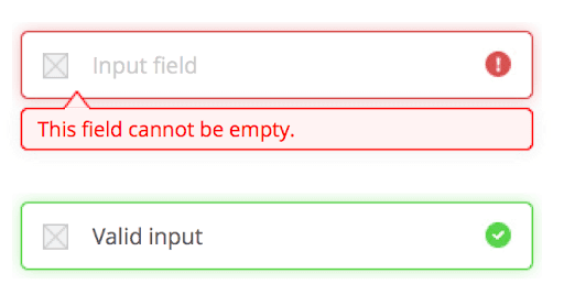
13. Error Message Display
Clear and specific error messages are crucial when validation fails. Avoid generic error messages like "Invalid input." Instead, pinpoint the exact issue and offer guidance on how to fix it (e.g., "Please enter a valid email address" or "This field requires a number").
14. Success States
Once a form is submitted successfully, provide a clear confirmation message. This could be a simple "Thank you" message or a more detailed success screen that summarizes the submitted information. A positive reinforcement loop encourages users to complete forms and creates a more satisfying experience.
Accessibility in Forms
Making your forms accessible to all users, including those with disabilities, is not only good practice but also expands your reach. Here are some key accessibility considerations:
15. Labeling and aria attributes: Descriptive labels for all form elements are essential. Utilize aria-labelledby attributes to connect labels with their corresponding fields for screen reader compatibility.
16. Keyboard Navigation: Ensure your form is fully navigable using just the keyboard. This allows users who rely on assistive technologies to complete the form without needing a mouse.
17. Error Identification: Error messages should be conveyed not just visually but also programmatically. Screen readers can then announce errors to users with visual impairments.
Form Animation and Micro-interactions:
Subtle animations and micro-interactions can add a layer of polish and user engagement to your forms. Here's how to implement them effectively:
18. Loading Animations
While data is being submitted or processed, use subtle loading animations to indicate activity and prevent users from thinking the form is frozen. A spinning progress indicator or a simple animation can go a long way in improving user perception.
19. Input Field Focus Animation
A subtle animation when a user clicks on an input field can provide visual confirmation and guide them through the form completion process. This is particularly helpful for users on touch-enabled devices.
20. Success and Error Animations
Use animations to visually communicate success or error states. A checkmark animation for successful submission or a shake animation for validation errors can provide clear and engaging feedback to users.
Color and Typography in Forms
The visual elements of your form play a significant role in readability and user experience. Here's how to leverage color and typography effectively:
21. Contrast and Legibility
Ensure adequate color contrast between text and background for optimal readability. Text should be easy to read on all devices, especially for users with visual impairments. Tools like WebAIM's WCAG Contrast Checker can help you verify sufficient contrast ratios.
22. Font Choice and Form Readability
Choose clear and professional fonts that are easy to read on all screen sizes. Avoid overly decorative or script fonts that can be difficult to decipher.
23. Using Color to Guide Users
Color can be a powerful tool to guide users through your form. For example, use a specific color to highlight required fields or to differentiate between sections. However, avoid using color as the sole means of conveying information, as some users might have color blindness.
Shorten Your Form with Conditional Logic
Conditional logic is a powerful tool that allows you to tailor the form experience based on user input. Here's how it works:
24. Scenario-Based Design
Ditch the one-size-fits-all approach. Conditional logic allows you to create different "paths" through the form based on user responses.
For example, if someone selects "United States" as their country, you might only ask for their city and state. But if they choose another country, different fields might appear that are relevant to that region.
This way, users aren't bombarded with unnecessary questions
25. Reduce Friction
By only showing relevant questions, conditional logic eliminates the need for users to wade through a bunch of fields that don't apply to them. This streamlines the form completion process, saving them time and frustration.
26. Increase Engagement
Nobody likes filling out long forms with irrelevant questions. Conditional logic keeps users engaged by presenting a personalized experience that feels relevant to their specific situation. This motivates them to complete the form without feeling bogged down.
Form Visuals and Structure
Crafting a visually appealing and well-structured form is just as important as its functionality. After all, users are more likely to complete forms that are easy to navigate and pleasant to look at. Here's a breakdown of key elements to consider when designing the visuals and structure of your forms:
Visual Appeal
27. Clean and Minimalist Design: Keep it simple! Avoid clutter and overwhelming users with excessive visual elements. Opt for clean layouts, ample white space, and a focus on the essential form fields.
28. Color and Contrast: Utilize color strategically to enhance readability and guide users through the form. Ensure adequate color contrast between text and background for optimal accessibility. Tools like WebAIM's WCAG Contrast Checker can help you verify sufficient contrast ratios.
29. Consistent Branding: Maintain a consistent visual identity that aligns with your overall brand aesthetic. This includes using your brand colors, fonts, and logos within the form design.
Structure and Usability
30. Logical Flow: Structure your form with a logical flow, guiding users progressively through the completion process. Group related questions together and avoid jumping between topics.
31. Clear Labels and Instructions: Use concise and easy-to-understand language for all labels and instructions. Avoid jargon and technical terms that your audience might not understand.
32. Form Field Selection: Choose the most appropriate form field type for each question. Text fields, drop-down menus, radio buttons, and checkboxes all have their purposes. Consider the type of data you're collecting and select the field that best facilitates user input.
33. Mobile-Friendly Design: A significant portion of users access forms on mobile devices. Ensure your forms are responsive and optimized for all screen sizes. This means using larger form fields for easy touch input and avoiding complex layouts that might not render well on smaller screens.
Errors and the Path to Completion in Form Design
Errors are an inevitable part of form filling, but how you handle them can make a world of difference in the user experience and ultimately, the completion rate of your forms. Here's how to approach errors in form design to keep users engaged and on the path to completion:
34. Preventing Errors
The best way to minimize errors is by providing crystal-clear instructions and labels for each form field. Avoid ambiguity and technical jargon. Use simple language that your target audience can easily understand.
Implement real-time input validation to catch errors as users enter data. This could involve highlighting incorrectly formatted email addresses, indicating missing required fields, or providing suggestions for valid input.
Consider using pre-filled fields with default values (when appropriate) to reduce the chance of typos or missing information.
35. Handling Errors with Grace
Provide clear and specific error messages directly next to the problematic field. Avoid generic messages like "Invalid input." Instead, pinpoint the exact issue and offer guidance on how to fix it (e.g., "Please enter a valid email address" or "This field requires a number").
Frame error messages in a helpful and informative way. Avoid accusatory language or overly technical terms. Use a conversational tone that guides users towards the correct input.
Even when correcting errors, use positive reinforcement. For example, "Thanks for fixing your email address!"
36. Guiding Users Towards Completion:
Use visual cues like color changes or subtle animations to highlight fields with errors. This draws the user's attention to the issue and prompts them to make the necessary corrections.
Avoid forcing users to start the entire form over after encountering an error. Allow them to correct mistakes and continue where they left off.
Implement progress bars or step-by-step indicators to show users how far they've progressed through the form. This helps maintain motivation and prevents them from abandoning the form due to frustration.
Test Your Form Before Sharing
This serves as a great reminder to users that testing is an essential step before deploying any form. It emphasizes the importance of a polished and user-friendly experience.
By following these final steps, you can ensure that your exceptional form not only looks great but also functions flawlessly and guides users towards successful completion.
Functionality Testing
37. Ensure your form functions correctly on desktops, laptops, tablets, and smartphones.
Different browsers may render elements slightly differently, so it's important to test across popular options like Chrome, Firefox, Safari, and Edge.
Go through the entire form completion process from start to finish. This allows you to identify any errors in logic, unclear instructions, or awkward phrasing.
Simulate different types of errors users might make (e.g., entering an invalid email address, leaving a required field blank). Verify that error messages are clear, specific, and guide users towards the correct input.
If your form uses conditional logic, test various scenarios to ensure the branching paths function as intended.
Usability Testing
38. Recruit a Small Group of Users
The ideal participants for your usability test should reflect your target audience for the form. This means considering demographics (age, location), technical skills, and any other relevant characteristics.
While a large sample size is ideal, even a small group of 5-7 users can reveal valuable insights.
There are various ways to recruit participants. You can reach out to existing customers, offer incentives for participation, or use online recruitment platforms.
39. Ask them to Complete the Form
Encourage users to "think aloud" as they complete the form. This means verbalizing their thoughts, feelings, and any questions they have while interacting with the form.
By listening to their thought process, you can gain valuable insights into potential areas of confusion or difficulty.
Provide users with a specific task or scenario to complete while using the form. This helps them approach the form with a goal in mind, mimicking real-world usage.
Consider using screen recording software to capture user interactions with the form. This can be helpful for reviewing user behavior later and identifying any hesitation points or missed functionalities.
40. Gather Feedback:
After completing the form, conduct a short interview with each user. Ask them specific questions about their experience, such as:
What was easy to understand on the form?
Did you encounter any difficulties completing the form?
Were the instructions clear and concise?
Did the layout feel logical and user-friendly?
Did you feel confident in the information you submitted?
Encourage open-ended questions to allow users to express their honest feedback, even if it's negative. This can reveal issues you might not have anticipated.
And yes, Don't forget to Thank participants for their time and feedback.
Accessibility Testing
41. Test with screen readers
What are screen readers? Imagine software that reads aloud the text and elements on a screen for users with visual impairments.
Testing with screen readers helps you verify if your form elements, labels, and instructions are clearly communicated by the software. This ensures users who rely on screen readers can understand and navigate your form just like anyone else
42. Check keyboard navigation
Not everyone uses a mouse!
Some users rely on keyboards to navigate websites and forms due to motor skill limitations or personal preference.
Keyboard navigation testing involves ensuring users can move through your form using just the Tab key, arrow keys, and Enter key. This guarantees that users who don't use a mouse can still complete your form without difficulty.
By following these testing procedures, you can identify and address any potential issues before sharing your form with the world. This will result in a more user-friendly, accessible, and ultimately more successful form that achieves your desired goals.
Conclusion
There you have it!
You've unlocked the secrets to crafting forms that are both user-friendly and effective. By prioritizing clarity, user experience, and a touch of visual appeal, you can transform your forms from data-vacuum cleaners into smooth journeys that users actually enjoy completing. This newfound knowledge can not only empower you to create exceptional forms but also serve as a springboard for even more creative form design inspiration.
Remember, happy users are more likely to convert, whatever your goal might be.
Ready to ditch the frustration and build forms that get results?
Metaforms is here to help!
We offer a toolbox full of resources to make designing exceptional forms easier than ever. From user-friendly templates to intuitive features, Meta Forms can help you create forms that are not only functional but also beautiful, accessible, and perfectly aligned with your brand.
Head over to our website or shoot us a message – we'd love to chat and show you how Meta Forms can help you unlock the full potential of your forms!
Ugh, forms! We've all been there.
You're excited to sign up for a free trial, download an ebook, or enter a contest, but then you hit that dreaded form. It seems endless, the instructions are unclear, and halfway through, you just want to slam your laptop shut.
Believe it or not, creating forms that frustrate users is a surprisingly common mistake. A study reveales that over 73% of people ditch forms because they're too complicated or long. That's a huge pool of potential customers or leads disappearing into the internet abyss, all because of a bad form design.
But hey, there's good news too!
Forms don't have to be the enemy. By understanding how users think and what makes a form user-friendly, you can create forms that are actually enjoyable to fill out.
This “40+ Form Design Inspiration Ideas and Best Practices” guide will show you the secrets to crafting forms that are clear, concise, and even (dare we say) fun to complete. Get ready to see your conversion rates soar and those abandoned forms become a thing of the past!
Why Forms Matter (and How They Can Be Better)
Good form design directly impacts your business goals. Users have limited patience and get easily confused by complexity. Studies show that unclear instructions, excessive form fields, and confusing layouts are all major contributors to form abandonment.
So, forms aren't the enemy – they're just misunderstood.
They're the gateway to capturing leads, closing deals, and building relationships with your audience. But just like that first date you meticulously planned, a poorly designed form can leave a bad impression and send potential customers running for the hills.
By understanding how users think and implementing some key best practices, you can transform your forms from formidable foes into digital BFFs. We'll show you how to create forms that are clear, concise, and even enjoyable to complete.
Recent Trends in Form Design
The world of form design is constantly evolving, with new trends emerging to improve user experience and increase completion rates. Here are some key trends.
Focus on User Experience (UX) First
Gone are the days of prioritizing functionality over user experience. Today's forms are designed with the user in mind. This means prioritizing clarity, ease of use, and a mobile-first approach.
A study by UserTesting found that a 70% improvement in task completion rates can be achieved by simply focusing on user experience. Metaforms echoes this sentiment, emphasizing the importance of creating forms that are intuitive and easy to navigate for all users.
Minimalism and Clean Design
Clean layouts, uncluttered interfaces, and clear labeling are all the rage in form design. Users appreciate forms that are easy to scan and understand at a glance. Formstack conducted a survey revealing that 64% of users find forms with clear and concise instructions more trustworthy.
Conditional Logic
Smart forms that adapt based on user input can significantly reduce form length and improve completion rates. Imagine a form that only asks for your city and state if you select "United States" as your country.
This personalization reduces friction and keeps users engaged by showing them only the relevant information they need to provide.
Progress Bars and Step-by-Step Layouts
Letting users know how far they've progressed through a form helps reduce abandonment rates. Step-by-step layouts make the process feel less daunting and provide users with a clear understanding of how much longer it will take to complete the form.
Rise of AI Forms
A recent innovation in form design is the emergence of AI-powered forms. These forms leverage artificial intelligence to automate tasks, personalize the user experience, and improve data collection accuracy. Here are some ways AI is being implemented in forms:
AI-powered Question Generation: AI can analyze your form's purpose and target audience to generate relevant and engaging questions automatically. This can save you time and effort in form creation.
Smart Autocomplete: AI can suggest answers to users as they type, reducing errors and speeding up the completion process.
Conversational Forms: These AI-powered forms mimic natural conversation, making the experience more user-friendly and engaging.
While AI forms are still a relatively new development, they hold promise for the future of form design. Metaform itself offers an AI Form Builder that utilizes some of these functionalities, allowing you to create intelligent forms that streamline data collection and improve user experience.
Components of a Form
A well-designed form is like a well-crafted recipe – each element plays a crucial role in the overall experience. Here are the key components to consider:
Form Fields: This is where users enter their information. Choose appropriate field types (text boxes, drop-down menus, radio buttons) based on the data you need to collect. Keep the number of fields to a minimum, only asking for what's truly necessary.
Clear Labels and Instructions: Use concise and easy-to-understand language for all labels and instructions. Avoid jargon and technical terms that your audience might not understand.
Error Handling and Validation: Implement error messages that are clear, specific, and actionable. Help users correct mistakes easily without frustration.
Call to Action: Clearly state what users should do after completing the form ("Submit," "Continue," etc.).
Psychology of Forms
Understanding user psychology is vital for creating forms that people actually enjoy completing.
People have limited attention spans online. Keep forms concise and visually appealing to avoid overwhelming users.
The form requires minimal mental effort to complete. Clear instructions, logical flow, and appropriate field types all contribute to a smooth experience.
Friction refers to any obstacle that prevents users from completing a form. Unclear instructions, excessive fields, and poor mobile responsiveness all create friction.
Use positive language and acknowledge successful form completion with a clear thank you message.
Audience, Purpose, and Context
The best forms are tailored to their specific audience, purpose, and context.
The first thing to consider is your audience!
Who are you trying to reach with this form?
Tailor the language, complexity, and overall design to resonate with your target audience.
What is the Purpose of your form?
What information are you trying to collect? Align the form fields and structure with your specific data collection goals.
What’s the Context?
Where will users encounter this form?
Is it embedded on a website, sent via email, or used for a specific event?
Optimize the form's design for the context in which it will be used.
Form Design Inspiration Ideas and Best Practices
Now that you're armed with the knowledge of essential components, user psychology, and audience considerations, it's time to translate that knowledge into action!
Form Layout
The form layout you choose for your form plays a significant role in how users interact with it. Let's look at them one by one.
1. Single-Column Forms
This is the simplest and most common layout, with all questions stacked vertically one after another. It's ideal for short forms or forms collecting basic information.
2. Multi-Column Forms
This layout allows you to distribute questions across multiple columns, which can be useful for longer forms or forms requiring users to compare options side-by-side. However, be mindful of using too many columns, as it can overwhelm users on smaller screens.
3. Step-by-Step Forms
This layout breaks down the form into distinct steps or sections, making the completion process feel less daunting. Progress bars can be added alongside each step to provide users with a visual cue of their progress. This layout is ideal for complex forms or those collecting a significant amount of data.
4. Mobile-Friendly Forms
With a significant portion of users accessing forms on mobile devices, ensuring a mobile-friendly layout is crucial. This means using responsive design principles, larger form fields for easy touch input, and avoiding complex layouts that might not render well on smaller screens.
Here’s a snapshot of finding the right form layout for your business needs!
Form Elements
The specific elements you choose will depend on the type of information you're trying to collect.
5. Input Fields and Text Areas
These are the workhorses of any form, allowing users to enter text data. Text fields are ideal for short entries like names or email addresses, while text areas are suited for longer responses or descriptions.
6. Dropdowns and Select Boxes
These elements present users with a list of pre-defined options from which they can choose one. They're useful for situations where there are a limited number of fixed choices, like selecting a country from a list.
7. Radio Buttons and Checkboxes
Radio buttons allow users to select only one option from a group of mutually exclusive choices (e.g., choosing a preferred payment method). Checkboxes, on the other hand, allow users to select multiple options from a list (e.g., selecting areas of interest).
8. Toggle Switches
These function similarly to the on/off switch you might find on an appliance. They provide a simple way for users to make quick binary choices within your form.
Imagine enabling or disabling a notification setting with a single click on a toggle switch.
9. Button Styles
These are the clickable buttons that users press to submit the form or navigate through different stages within the form itself.
Ensure the button labels are clear and concise, like "Submit" or "Next," so users understand what action will be triggered upon clicking.
You can also experiment with different button styles to enhance the overall visual appeal of your form.
10. File Uploads
File upload fields allow users to submit resumes, images, documents, or any other relevant files directly through your form. Most form builders offer a dedicated file upload field where users can browse their device and select the files they want to submit.
To ensure a smooth experience, clearly specify accepted file types (e.g., .pdf, .docx, .jpg) to avoid compatibility issues. Additionally, setting a maximum file size limitation helps prevent overloaded servers and guarantees faster upload times.
Consider providing visual progress indicators, especially for larger files, to keep users informed about the upload status.
11. Date Pickers and Calendars
Collecting date information doesn't have to be a struggle! Date pickers and calendar widgets simplify the selection process by offering a visual calendar interface.
Gone are the days of manual date entry, minimizing typos and improving data accuracy. Many form creation tools provide date picker elements. Users simply click on a calendar icon and visually choose their desired date.
To further enhance the user experience, you can pre-populate the date picker with a default range or preferred selection, saving users time.
Additionally, consider offering calendar customization options like highlighting weekends, specific dates, or date ranges to guide users towards the relevant selections.
Choosing the Right Element depends upon:
Type of Data: Match the element to the type of data you're collecting. Text fields for names, dropdowns for countries, radio buttons for preferred options, and so on.
Number of Choices: If there are a limited number of fixed options, use dropdowns or radio buttons. For multiple selections, checkboxes are the way to go.
Clarity and Ease of Use: Prioritize clear labels and intuitive functionality for each element.
Form Validation and Feedback
Ensuring users enter the correct information and guiding them through the completion process is essential for a positive form experience. Here's how to implement effective validation and feedback mechanisms:
12. Inline Validation
This involves providing real-time feedback to users as they enter data. For example, highlighting an incorrectly formatted email address or indicating a missing required field. Inline validation helps users identify and correct errors on the spot, preventing frustration later.
13. Error Message Display
Clear and specific error messages are crucial when validation fails. Avoid generic error messages like "Invalid input." Instead, pinpoint the exact issue and offer guidance on how to fix it (e.g., "Please enter a valid email address" or "This field requires a number").
14. Success States
Once a form is submitted successfully, provide a clear confirmation message. This could be a simple "Thank you" message or a more detailed success screen that summarizes the submitted information. A positive reinforcement loop encourages users to complete forms and creates a more satisfying experience.
Accessibility in Forms
Making your forms accessible to all users, including those with disabilities, is not only good practice but also expands your reach. Here are some key accessibility considerations:
15. Labeling and aria attributes: Descriptive labels for all form elements are essential. Utilize aria-labelledby attributes to connect labels with their corresponding fields for screen reader compatibility.
16. Keyboard Navigation: Ensure your form is fully navigable using just the keyboard. This allows users who rely on assistive technologies to complete the form without needing a mouse.
17. Error Identification: Error messages should be conveyed not just visually but also programmatically. Screen readers can then announce errors to users with visual impairments.
Form Animation and Micro-interactions:
Subtle animations and micro-interactions can add a layer of polish and user engagement to your forms. Here's how to implement them effectively:
18. Loading Animations
While data is being submitted or processed, use subtle loading animations to indicate activity and prevent users from thinking the form is frozen. A spinning progress indicator or a simple animation can go a long way in improving user perception.
19. Input Field Focus Animation
A subtle animation when a user clicks on an input field can provide visual confirmation and guide them through the form completion process. This is particularly helpful for users on touch-enabled devices.
20. Success and Error Animations
Use animations to visually communicate success or error states. A checkmark animation for successful submission or a shake animation for validation errors can provide clear and engaging feedback to users.
Color and Typography in Forms
The visual elements of your form play a significant role in readability and user experience. Here's how to leverage color and typography effectively:
21. Contrast and Legibility
Ensure adequate color contrast between text and background for optimal readability. Text should be easy to read on all devices, especially for users with visual impairments. Tools like WebAIM's WCAG Contrast Checker can help you verify sufficient contrast ratios.
22. Font Choice and Form Readability
Choose clear and professional fonts that are easy to read on all screen sizes. Avoid overly decorative or script fonts that can be difficult to decipher.
23. Using Color to Guide Users
Color can be a powerful tool to guide users through your form. For example, use a specific color to highlight required fields or to differentiate between sections. However, avoid using color as the sole means of conveying information, as some users might have color blindness.
Shorten Your Form with Conditional Logic
Conditional logic is a powerful tool that allows you to tailor the form experience based on user input. Here's how it works:
24. Scenario-Based Design
Ditch the one-size-fits-all approach. Conditional logic allows you to create different "paths" through the form based on user responses.
For example, if someone selects "United States" as their country, you might only ask for their city and state. But if they choose another country, different fields might appear that are relevant to that region.
This way, users aren't bombarded with unnecessary questions
25. Reduce Friction
By only showing relevant questions, conditional logic eliminates the need for users to wade through a bunch of fields that don't apply to them. This streamlines the form completion process, saving them time and frustration.
26. Increase Engagement
Nobody likes filling out long forms with irrelevant questions. Conditional logic keeps users engaged by presenting a personalized experience that feels relevant to their specific situation. This motivates them to complete the form without feeling bogged down.
Form Visuals and Structure
Crafting a visually appealing and well-structured form is just as important as its functionality. After all, users are more likely to complete forms that are easy to navigate and pleasant to look at. Here's a breakdown of key elements to consider when designing the visuals and structure of your forms:
Visual Appeal
27. Clean and Minimalist Design: Keep it simple! Avoid clutter and overwhelming users with excessive visual elements. Opt for clean layouts, ample white space, and a focus on the essential form fields.
28. Color and Contrast: Utilize color strategically to enhance readability and guide users through the form. Ensure adequate color contrast between text and background for optimal accessibility. Tools like WebAIM's WCAG Contrast Checker can help you verify sufficient contrast ratios.
29. Consistent Branding: Maintain a consistent visual identity that aligns with your overall brand aesthetic. This includes using your brand colors, fonts, and logos within the form design.
Structure and Usability
30. Logical Flow: Structure your form with a logical flow, guiding users progressively through the completion process. Group related questions together and avoid jumping between topics.
31. Clear Labels and Instructions: Use concise and easy-to-understand language for all labels and instructions. Avoid jargon and technical terms that your audience might not understand.
32. Form Field Selection: Choose the most appropriate form field type for each question. Text fields, drop-down menus, radio buttons, and checkboxes all have their purposes. Consider the type of data you're collecting and select the field that best facilitates user input.
33. Mobile-Friendly Design: A significant portion of users access forms on mobile devices. Ensure your forms are responsive and optimized for all screen sizes. This means using larger form fields for easy touch input and avoiding complex layouts that might not render well on smaller screens.
Errors and the Path to Completion in Form Design
Errors are an inevitable part of form filling, but how you handle them can make a world of difference in the user experience and ultimately, the completion rate of your forms. Here's how to approach errors in form design to keep users engaged and on the path to completion:
34. Preventing Errors
The best way to minimize errors is by providing crystal-clear instructions and labels for each form field. Avoid ambiguity and technical jargon. Use simple language that your target audience can easily understand.
Implement real-time input validation to catch errors as users enter data. This could involve highlighting incorrectly formatted email addresses, indicating missing required fields, or providing suggestions for valid input.
Consider using pre-filled fields with default values (when appropriate) to reduce the chance of typos or missing information.
35. Handling Errors with Grace
Provide clear and specific error messages directly next to the problematic field. Avoid generic messages like "Invalid input." Instead, pinpoint the exact issue and offer guidance on how to fix it (e.g., "Please enter a valid email address" or "This field requires a number").
Frame error messages in a helpful and informative way. Avoid accusatory language or overly technical terms. Use a conversational tone that guides users towards the correct input.
Even when correcting errors, use positive reinforcement. For example, "Thanks for fixing your email address!"
36. Guiding Users Towards Completion:
Use visual cues like color changes or subtle animations to highlight fields with errors. This draws the user's attention to the issue and prompts them to make the necessary corrections.
Avoid forcing users to start the entire form over after encountering an error. Allow them to correct mistakes and continue where they left off.
Implement progress bars or step-by-step indicators to show users how far they've progressed through the form. This helps maintain motivation and prevents them from abandoning the form due to frustration.
Test Your Form Before Sharing
This serves as a great reminder to users that testing is an essential step before deploying any form. It emphasizes the importance of a polished and user-friendly experience.
By following these final steps, you can ensure that your exceptional form not only looks great but also functions flawlessly and guides users towards successful completion.
Functionality Testing
37. Ensure your form functions correctly on desktops, laptops, tablets, and smartphones.
Different browsers may render elements slightly differently, so it's important to test across popular options like Chrome, Firefox, Safari, and Edge.
Go through the entire form completion process from start to finish. This allows you to identify any errors in logic, unclear instructions, or awkward phrasing.
Simulate different types of errors users might make (e.g., entering an invalid email address, leaving a required field blank). Verify that error messages are clear, specific, and guide users towards the correct input.
If your form uses conditional logic, test various scenarios to ensure the branching paths function as intended.
Usability Testing
38. Recruit a Small Group of Users
The ideal participants for your usability test should reflect your target audience for the form. This means considering demographics (age, location), technical skills, and any other relevant characteristics.
While a large sample size is ideal, even a small group of 5-7 users can reveal valuable insights.
There are various ways to recruit participants. You can reach out to existing customers, offer incentives for participation, or use online recruitment platforms.
39. Ask them to Complete the Form
Encourage users to "think aloud" as they complete the form. This means verbalizing their thoughts, feelings, and any questions they have while interacting with the form.
By listening to their thought process, you can gain valuable insights into potential areas of confusion or difficulty.
Provide users with a specific task or scenario to complete while using the form. This helps them approach the form with a goal in mind, mimicking real-world usage.
Consider using screen recording software to capture user interactions with the form. This can be helpful for reviewing user behavior later and identifying any hesitation points or missed functionalities.
40. Gather Feedback:
After completing the form, conduct a short interview with each user. Ask them specific questions about their experience, such as:
What was easy to understand on the form?
Did you encounter any difficulties completing the form?
Were the instructions clear and concise?
Did the layout feel logical and user-friendly?
Did you feel confident in the information you submitted?
Encourage open-ended questions to allow users to express their honest feedback, even if it's negative. This can reveal issues you might not have anticipated.
And yes, Don't forget to Thank participants for their time and feedback.
Accessibility Testing
41. Test with screen readers
What are screen readers? Imagine software that reads aloud the text and elements on a screen for users with visual impairments.
Testing with screen readers helps you verify if your form elements, labels, and instructions are clearly communicated by the software. This ensures users who rely on screen readers can understand and navigate your form just like anyone else
42. Check keyboard navigation
Not everyone uses a mouse!
Some users rely on keyboards to navigate websites and forms due to motor skill limitations or personal preference.
Keyboard navigation testing involves ensuring users can move through your form using just the Tab key, arrow keys, and Enter key. This guarantees that users who don't use a mouse can still complete your form without difficulty.
By following these testing procedures, you can identify and address any potential issues before sharing your form with the world. This will result in a more user-friendly, accessible, and ultimately more successful form that achieves your desired goals.
Conclusion
There you have it!
You've unlocked the secrets to crafting forms that are both user-friendly and effective. By prioritizing clarity, user experience, and a touch of visual appeal, you can transform your forms from data-vacuum cleaners into smooth journeys that users actually enjoy completing. This newfound knowledge can not only empower you to create exceptional forms but also serve as a springboard for even more creative form design inspiration.
Remember, happy users are more likely to convert, whatever your goal might be.
Ready to ditch the frustration and build forms that get results?
Metaforms is here to help!
We offer a toolbox full of resources to make designing exceptional forms easier than ever. From user-friendly templates to intuitive features, Meta Forms can help you create forms that are not only functional but also beautiful, accessible, and perfectly aligned with your brand.
Head over to our website or shoot us a message – we'd love to chat and show you how Meta Forms can help you unlock the full potential of your forms!

SAAS Pricing Calculators: B2B v B2C Online Forms.
The SaaS pricing calculator is an essential tool for both B2B and B2C SaaS companies. But how do you build it, right? We have you covered.

B2B SaaS: Making Book a Demo Form.
Having the perfect book a demo form for B2B SaaS is the first step in capturing leads. There are a few fundamental techniques to get this form right. Read on.

How to Get Started With SaaS Onboarding.
SaaS onboarding is essential for customer onboarding in B2B and B2C SaaS. Let’s understand its fundamentals, including the metrics.
Customer Feedback Form: B2B vs B2C.
Why is customer feedback important? Because it dictates progress on B2B and B2B products and services for the customer to meet their goals.
SaaS Customer Feedback Form: 6 Main Types.
As much as SaaS is self-serve, the role of a customer feedback form is highly relevant. There are different types, each with its use case and sections.

Role of a Product Survey in SaaS.
SaaS is all about creating products for specific use cases. This is where a product survey becomes all the more important to know the user deeply.

Should You Do a SaaS Market Survey?
Every SaaS company wants to grow fast. But without a market survey, growth isn't possible or sustainable. Let’s see how to do a market survey.
SAAS Pricing Calculators: B2B v B2C Online Forms.
The SaaS pricing calculator is an essential tool for both B2B and B2C SaaS companies. But how do you build it, right? We have you covered.
B2B SaaS: Making Book a Demo Form.
Having the perfect book a demo form for B2B SaaS is the first step in capturing leads. There are a few fundamental techniques to get this form right. Read on.
How to Get Started With SaaS Onboarding.
SaaS onboarding is essential for customer onboarding in B2B and B2C SaaS. Let’s understand its fundamentals, including the metrics.
Customer Feedback Form: B2B vs B2C.
Why is customer feedback important? Because it dictates progress on B2B and B2B products and services for the customer to meet their goals.
SaaS Customer Feedback Form: 6 Main Types.
As much as SaaS is self-serve, the role of a customer feedback form is highly relevant. There are different types, each with its use case and sections.
Role of a Product Survey in SaaS.
SaaS is all about creating products for specific use cases. This is where a product survey becomes all the more important to know the user deeply.
Should You Do a SaaS Market Survey?
Every SaaS company wants to grow fast. But without a market survey, growth isn't possible or sustainable. Let’s see how to do a market survey.

Nine Types of Healthcare and Medical Forms.
Medical forms are a must-have for any healthcare business or practitioner. Learn about the different kinds of medical and healthcare forms.

4 Tips for Better Medical History Forms.
Medical history forms are central to patient care, onboarding, and medical administration records. Learn how to make them easier to fill.

How to Build Mental Health Intake Forms?
Mental health intake forms are not like patient intake forms. Mental health intake forms deal with far more sensitive data and have specific design methods.

What, Why and How of Telemedicine Forms.
Telemedicine is on the rise and with different form builders out there, which one best suits your needs as a healthcare services provider?

3 Reasons for Major Drop-Offs in Medical Forms.
No matter which healthcare form we pick, there are major drop-off reasons. We shall dive into the top 3 and learn how to resolve them in your next form.

Patient Onboarding Forms - From Click to Clinic.
Patient onboarding forms are the first touchpoint for patients; getting this right for higher conversion rates is a must-have. Learn how to perfect them now.

5 Key Parts of a Good Patient Satisfaction Form.
The goal of patient satisfaction surveys is to course-correct the services of a healthcare provider. Patient feedback leads to a culture of patient-centric care.
Build Quick and Easy Medical Release Forms.
Every HIPAA-compliant healthcare provider comes across medical release forms that involve details from medical history forms. Can they be shipped fast? Yes.
SAAS Pricing Calculators: B2B v B2C Online Forms.
The SaaS pricing calculator is an essential tool for both B2B and B2C SaaS companies. But how do you build it, right? We have you covered.
B2B SaaS: Making Book a Demo Form.
Having the perfect book a demo form for B2B SaaS is the first step in capturing leads. There are a few fundamental techniques to get this form right. Read on.
How to Get Started With SaaS Onboarding.
SaaS onboarding is essential for customer onboarding in B2B and B2C SaaS. Let’s understand its fundamentals, including the metrics.
Customer Feedback Form: B2B vs B2C.
Why is customer feedback important? Because it dictates progress on B2B and B2B products and services for the customer to meet their goals.
SaaS Customer Feedback Form: 6 Main Types.
As much as SaaS is self-serve, the role of a customer feedback form is highly relevant. There are different types, each with its use case and sections.
Role of a Product Survey in SaaS.
SaaS is all about creating products for specific use cases. This is where a product survey becomes all the more important to know the user deeply.
Should You Do a SaaS Market Survey?
Every SaaS company wants to grow fast. But without a market survey, growth isn't possible or sustainable. Let’s see how to do a market survey.

Subscribe to stay updated.
Subscribe to stay updated.
Subscribe to stay updated.
HC

HC

HC

HC

70+ people from across industries read our emails.
HC
HC
70+ people from across industries read our emails.
HC
HC
HC
70+ people from across industries read our emails.


Bangalore, India / San Francisco, US
WorkHack Inc. 2023


Bangalore, India
San Francisco, US
WorkHack Inc. 2023
WorkHack Inc. 2023
Bangalore, India / San Francisco, US
WorkHack Inc. 2023
Bangalore, India / San Francisco, US